Yervoy Injection
Product Images NDC 0003-2328

View Photos of Packaging, Regulatory Labels, and Product Appearance

Product Visual Gallery

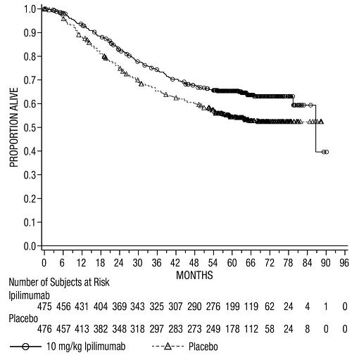
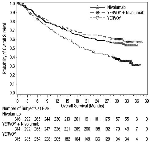
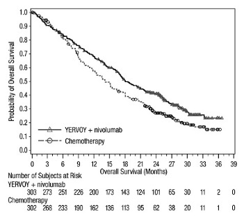
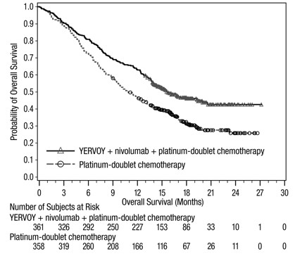
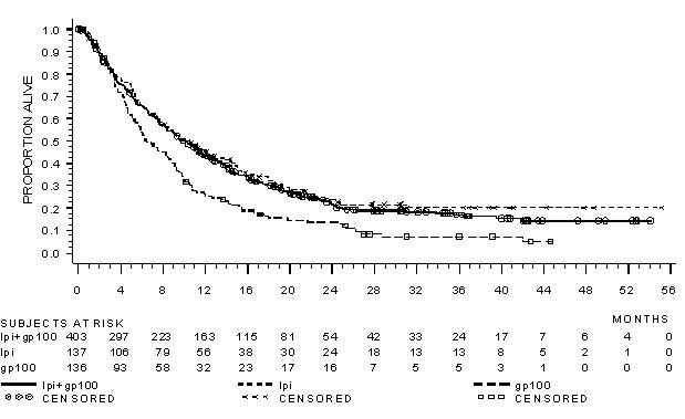
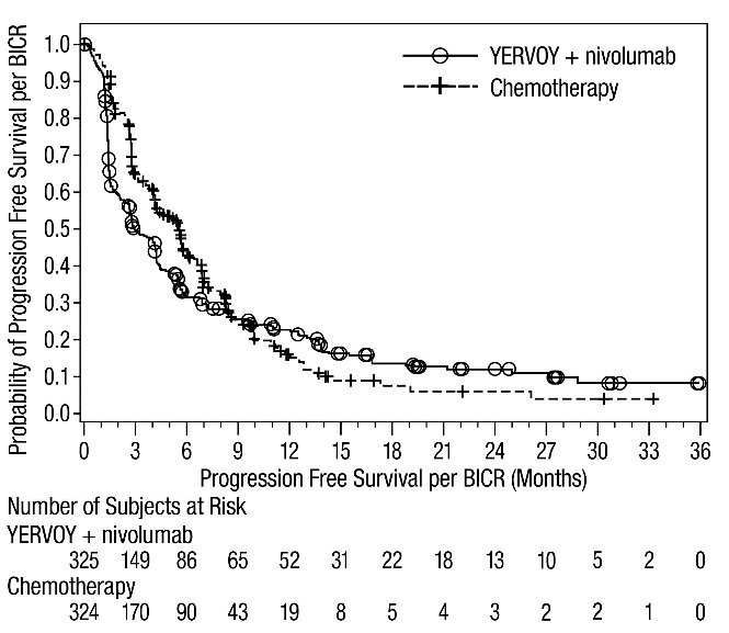
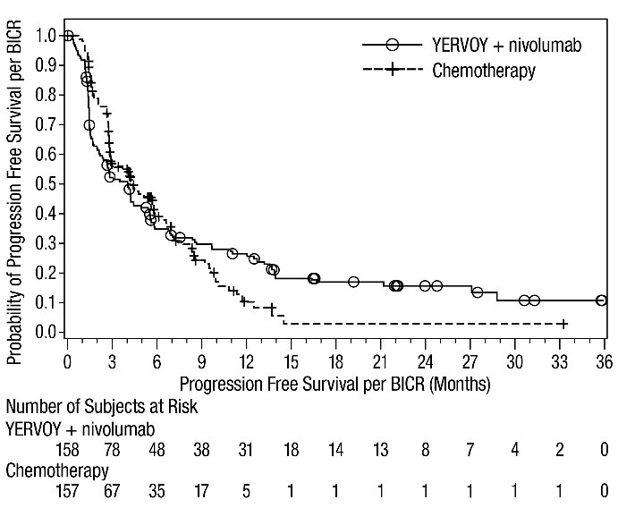
This gallery contains 13 technical images submitted to the FDA as part of the official labeling for Yervoy (NDC 0003-2328). Unlike standard consumer photos, these assets often include clinical data figures, molecular chemical structures, and official manufacturer packaging layouts.

As provided by E.r. Squibb & Sons, L.l.c., these visuals offer a comprehensive scientific overview of the product's physical and chemical identity, aiding pharmacists and researchers in product verification and study.

FDA Label Image

Yervoy 200mg Carton Serialized

Yervoy 200mg Carton Serialized
YERVOY* (ipilimumab) injection.*
FDA Label Image

Yervoy 50mg Carton Serialized

FDA Label Image

Yervoy Os Ca184 029

Yervoy Os Ca184 029
This appears to be a table or graph with some numerical data and labels. It is not very clear what the numbers and labels represent without additional context. Therefore, a useful description cannot be provided.*
FDA Label Image

Yervoy Os Checkmate 067

Yervoy Os Checkmate 067
This appears to be a table with data related to the usage of different treatments for cancer (Nivolumab, Ipilimumab (YERVOY), and a combination of both). The table appears to show the number of subjects and their corresponding survival rates in months.*
FDA Label Image

Yervoy Os Checkmate 214

Yervoy Os Checkmate 214
The text provides a chart regarding the Overall Survival probability for the drugs OPDIVO + ipilmumab and Sunitinib. The chart shows the number of subjects at risk over time in months. The probability of overall survival is not mentioned.*
FDA Label Image

Yervoy Os Checkmate 227

Yervoy Os Checkmate 227
This is a graph that shows the Probability of Overall Survival in patients treated with a combination of YERVOY + nivolumab and platinum-doublet chemotherapy. The X-axis shows the time in months and the Y-axis shows the Probability of Overall Survival. The blue line represents the YERVOY + nivolumab treatment, and the orange line represents the platinum-doublet chemotherapy treatment. The graph provides a visual representation of the number of subjects at risk, as well as the number of subjects who survived at each point in time.*
FDA Label Image

Yervoy Os Checkmate 648 A

Yervoy Os Checkmate 648 A
This appears to be a graph of Overall Survival for YERVOY + nivolumab vs. Chemotherapy, with survival rate plotted against the number of months.*
FDA Label Image

Yervoy Os Checkmate 648 B

Yervoy Os Checkmate 648 B
This is a description of a graph showing the Overall Survival (in months) of subjects treated either with Yervoy and nivolumab, or with Chemotherapy. The X-axis represents the time of the treatment (in months), and the Y-axis represents the number of subjects at risk. The number of subjects at risk decreases over time and is shown for the different time points on the graph.*
FDA Label Image

Yervoy Os Checkmate 743

FDA Label Image

Yervoy Os Checkmate 9la

Yervoy Os Checkmate 9la
This appears to be a report presenting data on the probability of overall survival for patients receiving a combination of YERVOY, nivolumab, and platinum-doublet chemotherapy compared to those receiving platinum-doublet chemotherapy alone. The report includes a chart showing the number of subjects at risk over time and a graph depicting overall survival in months. Additionally, the report lists survival percentages at specific time intervals for each treatment group.*
FDA Label Image

Yervoy Os Mdx010 20

Yervoy Os Mdx010 20
This appears to be a table or graph related to the proportion of subjects alive in some study, along with the number of subjects at risk each month. Unfortunately, the text is not easily readable in its current format.*
FDA Label Image

Yervoy Pfs Checkmate 648 A

Yervoy Pfs Checkmate 648 A
This may be a graphical representation of Progression Free Survival (PFS) of two treatments: YERVOY + nivolumab and chemotherapy. The PFS is indicated on the y-axis and the time periods on the x-axis. The number of subjects at risk is also provided for each time period. The YERVOY + nivolumab treatment may have shown better PFS than chemotherapy, as indicated by the higher number of subjects at risk in the early time periods. However, without more context or analysis, it is difficult to make definitive conclusions.*
FDA Label Image

Yervoy Pfs Checkmate 648 B

Yervoy Pfs Checkmate 648 B
This is a chart that provides information on the probability of progression-free survival per BICR for a treatment called YERVOY + nivolumab compared to chemotherapy. The chart shows the progression-free survival per BICR (in months) and the number of subjects at risk for each treatment group at different time points. There are no other details available.*

* These product label images have been analyzed using experimental machine learning. Please verify findings with the primary label text.