Keytruda
Product Images NDC 0006-3029

28 FDA label images from Merck Sharp & Dohme Llc · Packaging, Regulatory Labels, and Product Appearance

Product Visual Gallery

This gallery contains 28 technical images submitted to the FDA as part of the official labeling for Keytruda (NDC 0006-3029). Unlike standard consumer photos, these assets often include clinical data figures, molecular chemical structures, and official manufacturer packaging layouts.

As provided by Merck Sharp & Dohme Llc, these visuals offer a comprehensive scientific overview of the product's physical and chemical identity, aiding pharmacists and researchers in product verification and study.

FDA Label Image

Figure 1 (Keytruda 01)
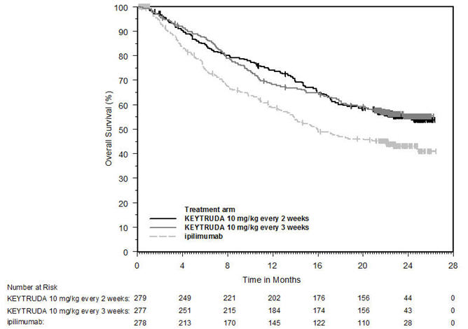
Figure 1 (Keytruda 01)
This chart shows overall survival percentage over time in months for three treatment arms: KEYTRUDA 10 mg/kg every 2 weeks, KEYTRUDA 10 mg/kg every 3 weeks, and ipilimumab. The x-axis represents time in months, and the y-axis represents overall survival percentage. A table below the graph indicates the number of patients at risk for each treatment arm at various time points.*
FDA Label Image

Figure 2 (Keytruda 02)

Figure 2 (Keytruda 02)
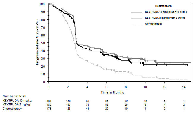
A Kaplan-Meier curve chart showing progression-free survival percentage over time in months for three treatment arms: KEYTRUDA 10 mg/kg every 3 weeks, KEYTRUDA 2 mg/kg every 3 weeks, and chemotherapy. The chart includes a table with the number of patients at risk at different time points for each treatment arm.*
FDA Label Image

Figure 3 (Keytruda 02a)

Figure 3 (Keytruda 02a)
A Kaplan-Meier curve showing recurrence-free survival (%) over time in months up to 24 months comparing KEYTRUDA 25 mg/mL treatment arm versus placebo. The graph illustrates higher recurrence-free survival in the KEYTRUDA arm compared to placebo, with numbers at risk shown below the x-axis for each group at various time points.*
FDA Label Image

Figure 4 (Keytruda 03)

Figure 4 (Keytruda 03)
A Kaplan-Meier survival curve comparing overall survival (%) over time in months between KEYTRUDA 25 mg/mL treatment arm and control group. The graph shows a higher survival rate for the KEYTRUDA group throughout the study period up to 42 months. A risk table below indicates the number of patients at risk at various time points for both groups.*
FDA Label Image

Figure 7 (Keytruda 04)

Figure 7 (Keytruda 04)
A survival curve chart comparing overall survival percentages over time in months for KEYTRUDA 25 mg/mL and chemotherapy treatment arms. The graph shows two distinct curves with KEYTRUDA in a solid black line having higher survival rates than chemotherapy in a dashed gray line. A risk table is displayed below the x-axis showing patient numbers at different time points for both groups.*
FDA Label Image

Figure 5 (Keytruda 04a)

Figure 5 (Keytruda 04a)
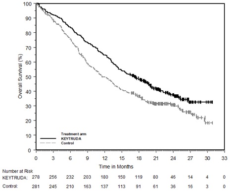
A Kaplan-Meier survival curve chart showing overall survival percentage over time in months, comparing KEYTRUDA treatment arm to a control group. The KEYTRUDA group is represented by a solid black line exhibiting higher survival rates than the control group's dashed gray line. A table below the graph displays the number of patients at risk at various time points for each group.*
FDA Label Image

Figure 6 (Keytruda 04b)

Figure 6 (Keytruda 04b)
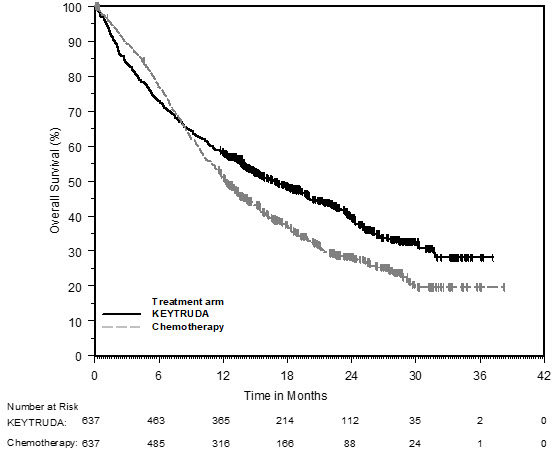
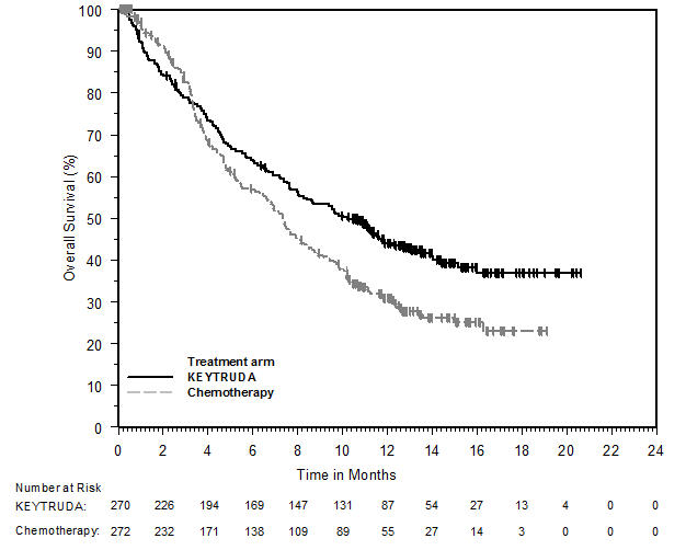
A Kaplan-Meier overall survival curve comparing KEYTRUDA (25 mg/mL) to chemotherapy over time in months. The graph shows overall survival percentage on the Y-axis and time in months on the X-axis, with KEYTRUDA represented by a black line and chemotherapy by a gray line. A table below the graph lists numbers at risk for each treatment arm at various time points.*
FDA Label Image

Figure 8 (Keytruda 05)

Figure 8 (Keytruda 05)
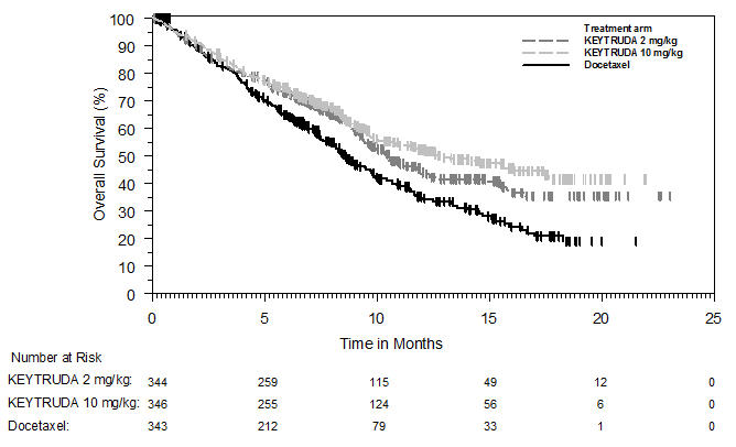
A survival curve graph depicting overall survival (%) over time in months for three treatment arms: KEYTRUDA 2 mg/kg, KEYTRUDA 10 mg/kg, and Docetaxel. The chart includes a table showing the number of patients at risk at various time points for each treatment group.*
FDA Label Image

Figure 9 (Keytruda 05a)

Figure 9 (Keytruda 05a)
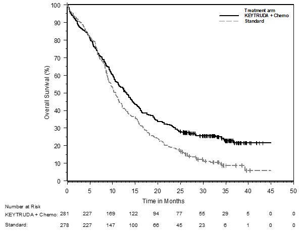
A Kaplan-Meier survival curve comparing overall survival percentages over time in months between two treatment arms: KEYTRUDA + Chemotherapy and Standard. The graph plots survival percentage on the vertical axis against time up to 50 months on the horizontal axis, showing higher survival rates for the KEYTRUDA + Chemo arm throughout the period.*
FDA Label Image

Figure 10 (Keytruda 05b)

Figure 10 (Keytruda 05b)
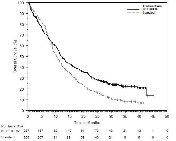
A survival curve chart comparing overall survival percentage over time in months for patients treated with KEYTRUDA 25 mg/mL versus a standard treatment arm. The graph includes two lines representing survival trends and a numbers-at-risk table showing patient counts at various time points for each group.*
FDA Label Image

Figure 11 (Keytruda 05c)

Figure 11 (Keytruda 05c)
A progression-free survival Kaplan-Meier curve comparing KEYTRUDA and Brentuximab Vedotin treatment arms over time in months. The y-axis shows progression-free survival percentage, and the x-axis shows time up to 42 months. The chart includes the number of patients at risk for both treatments at various time points.*
FDA Label Image

Figure 12 (Keytruda 06)

Figure 12 (Keytruda 06)
A Kaplan-Meier curve comparing overall survival (%) over time in months between KEYTRUDA 25 mg/mL and chemotherapy treatment arms. The graph shows survival probabilities declining over a 20-month period, with KEYTRUDA (black line) demonstrating higher overall survival than chemotherapy (gray line). Below the graph is a table listing the number of patients at risk at various time points for both treatment groups.*
FDA Label Image

Figure 15 (Keytruda 06a)

Figure 15 (Keytruda 06a)
A Kaplan-Meier survival curve comparing overall survival percentage over time in months between patients treated with KEYTRUDA and a control group. The graph includes lines representing the KEYTRUDA treatment arm and the control arm, with a number-at-risk table below indicating the number of patients remaining at various time points.*
FDA Label Image

Figure 16 (Keytruda 06b)

Figure 16 (Keytruda 06b)
A survival curve chart comparing overall survival percentage over time in months between two treatment arms: KEYTRUDA + Axitinib and Sunitinib. The chart includes a legend and a table showing the number of patients at risk at different time points for each treatment group.*
FDA Label Image

Figure 13 (Keytruda 06c)

Figure 13 (Keytruda 06c)
A Kaplan-Meier survival curve comparing progression-free survival (%) over time in months between two treatment arms: KEYTRUDA and chemotherapy. The graph displays a higher progression-free survival rate for the KEYTRUDA group across the timeline up to 48 months, with the number of patients at risk listed below for each treatment over intervals.*
FDA Label Image

Figure 17 (Keytruda 06d)

Figure 17 (Keytruda 06d)
A Kaplan-Meier survival curve showing progression-free survival percentage over time in months comparing two treatment arms: KEYTRUDA + Chemotherapy and Placebo + Chemotherapy. The graph includes a number-at-risk table below the x-axis for each group at various time points up to 33 months.*
FDA Label Image

Figure 14 (Keytruda 06e)

Figure 14 (Keytruda 06e)
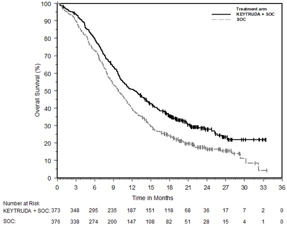
A Kaplan-Meier overall survival curve comparing KEYTRUDA + standard of care (SOC) versus SOC alone over 36 months. The y-axis shows overall survival percentage, and the x-axis indicates time in months. The chart includes a table of the number of patients at risk at various time points for both treatment arms.*
FDA Label Image

Keytruda 06f

Keytruda 06f
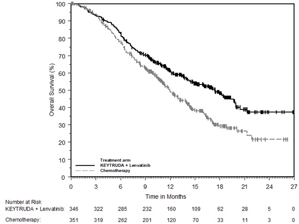
A Kaplan-Meier survival curve chart comparing overall survival percentage over time in months for patients treated with KEYTRUDA plus Lenvatinib versus chemotherapy. The chart includes a legend and a table below showing the number of patients at risk at various time points for each treatment arm.*
FDA Label Image

Keytruda 06g

Keytruda 06g
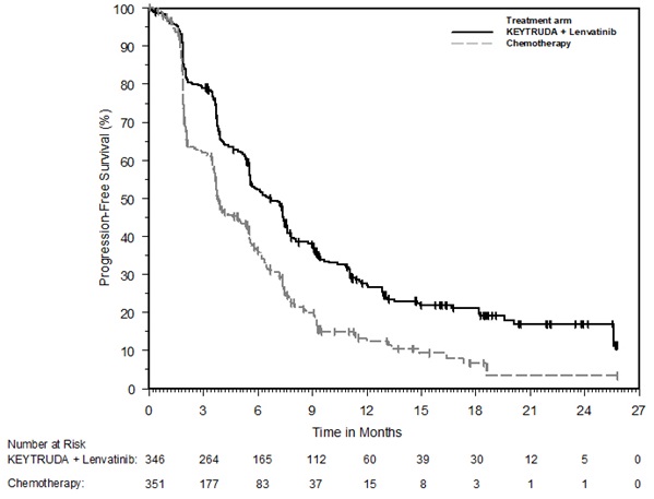
A Kaplan-Meier survival curve graph depicting progression-free survival percentages over time in months. It compares two treatment arms: KEYTRUDA plus Lenvatinib (black line) and Chemotherapy (gray line). The x-axis shows time in months up to 27, and the y-axis shows progression-free survival percentage from 0 to 100. Below the graph, the number of patients at risk is listed for each treatment at various time points.*
FDA Label Image

Keytruda 06h

Keytruda 06h
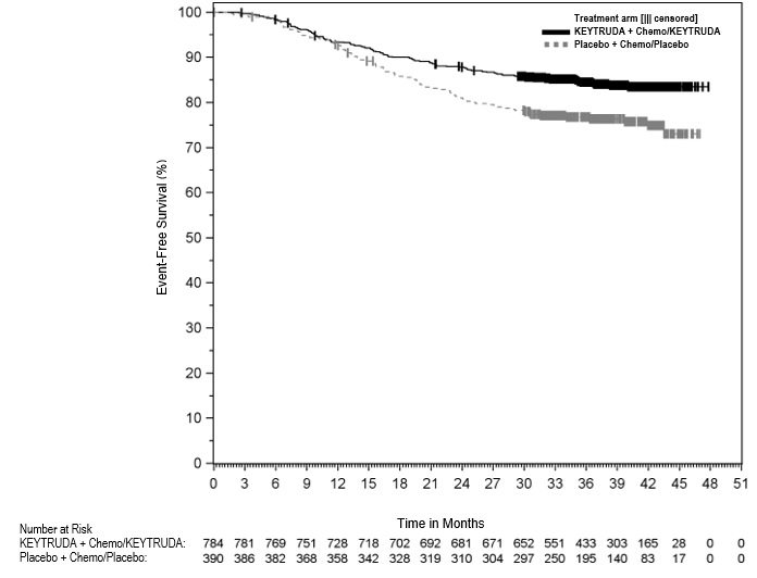
A survival curve chart showing event-free survival percentage over time in months for two treatment arms: KEYTRUDA plus chemotherapy (solid black line) and placebo plus chemotherapy (dashed gray line). The chart includes a number at risk table for each time point, comparing patient counts for both groups from 784 and 390 at baseline, respectively, decreasing over the 51-month follow-up.*
FDA Label Image

Keytruda 06i

Keytruda 06i
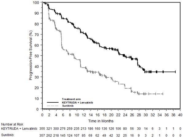
A Kaplan-Meier survival curve chart showing progression-free survival percentage over time in months. The chart compares two treatment arms: KEYTRUDA plus Lenvatinib and Sunitinib. The KEYTRUDA plus Lenvatinib group shows higher progression-free survival rates throughout the study period. The number of patients at risk for each treatment at various time points is listed below the graph.*
FDA Label Image

Keytruda 06j

Keytruda 06j
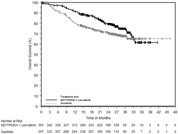
A Kaplan-Meier survival curve chart comparing overall survival (%) over time in months for KEYTRUDA 25 mg/mL combined with Lenvatinib versus Sunitinib. The x-axis represents time in months up to 48, and the y-axis shows overall survival percentage from 0 to 100. The chart includes patient numbers at risk below the x-axis for each treatment arm at various months.*
FDA Label Image

Keytruda 06k

Keytruda 06k
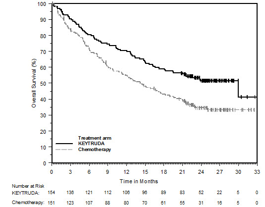
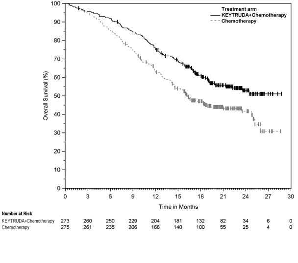
A Kaplan-Meier survival curve comparing overall survival (%) over time in months for two treatment arms: KEYTRUDA plus chemotherapy versus chemotherapy alone. The graph shows survival percentages declining over 30 months, with the KEYTRUDA plus chemotherapy arm consistently exhibiting higher survival. Below the x-axis, numbers at risk for each treatment group are displayed over different time points.*
FDA Label Image

Keytruda 06l

Keytruda 06l
A Kaplan-Meier survival curve chart comparing disease-free survival (%) over time in months between patients treated with KEYTRUDA and placebo. The chart includes number at risk data for both groups at various time points up to 42 months, showing a higher disease-free survival trend for the KEYTRUDA treatment arm.*
FDA Label Image

Keytruda 06m

Keytruda 06m
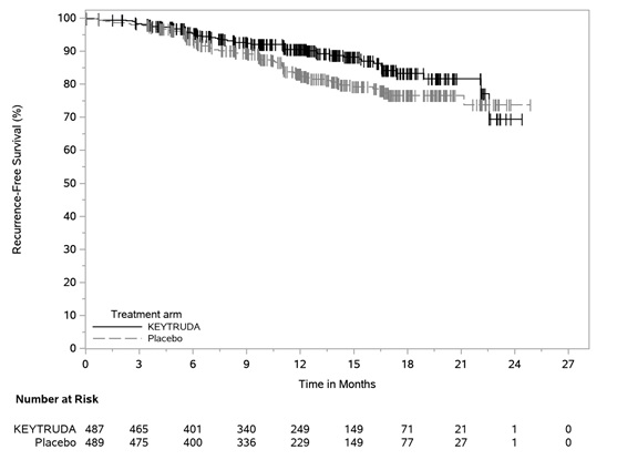
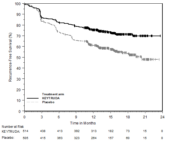
A Kaplan-Meier curve chart showing recurrence-free survival percentage over time in months comparing KEYTRUDA 25 mg/mL to placebo. The chart includes two survival curves, with KEYTRUDA represented by a solid line and placebo by a dashed line, demonstrating higher survival rates for KEYTRUDA throughout the 24-month period. A number at risk table is provided below the x-axis for both groups.*
FDA Label Image

Keytruda 06n

Keytruda 06n
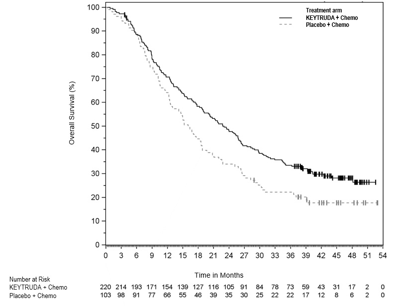
A Kaplan-Meier survival curve chart showing overall survival percentage over time in months. The chart compares two treatment arms: KEYTRUDA + Chemo (solid line) and Placebo + Chemo (dashed line). The survival percentage decreases over time for both groups, with KEYTRUDA + Chemo showing higher overall survival compared to Placebo + Chemo. The number of patients at risk is indicated below the time axis for each treatment group.*
FDA Label Image

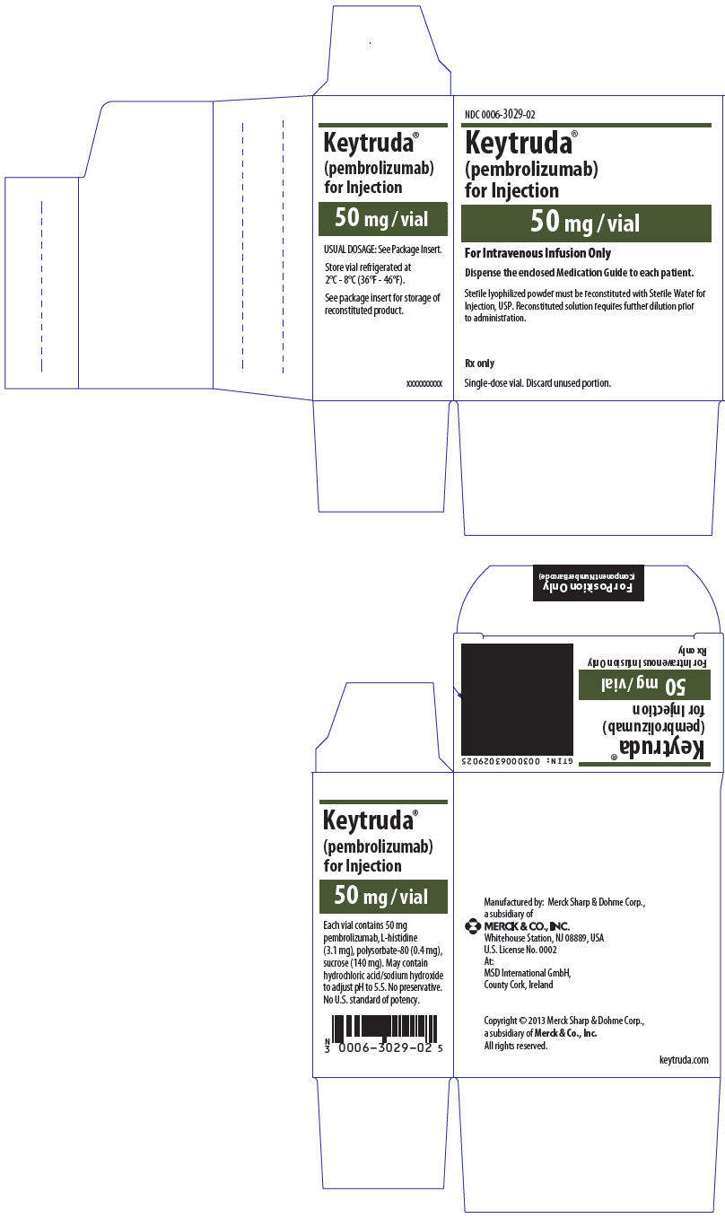
Principal Display Panel (50 mg Vial Carton)

Principal Display Panel (50 mg Vial Carton)
Packaging label for Keytruda (pembrolizumab) 50 mg vial for injection. The label includes dosing instructions, storage requirements between 2°C and 8°C, and notes it is for intravenous infusion only. Manufactured by Merck Sharp & Dohme LLC, the label also lists vial ingredients and cautions to discard unused portions of the single-dose vial.*
FDA Label Image

Principal Display Panel (100 mg/4 mL Vial Carton)

Principal Display Panel (100 mg/4 mL Vial Carton)
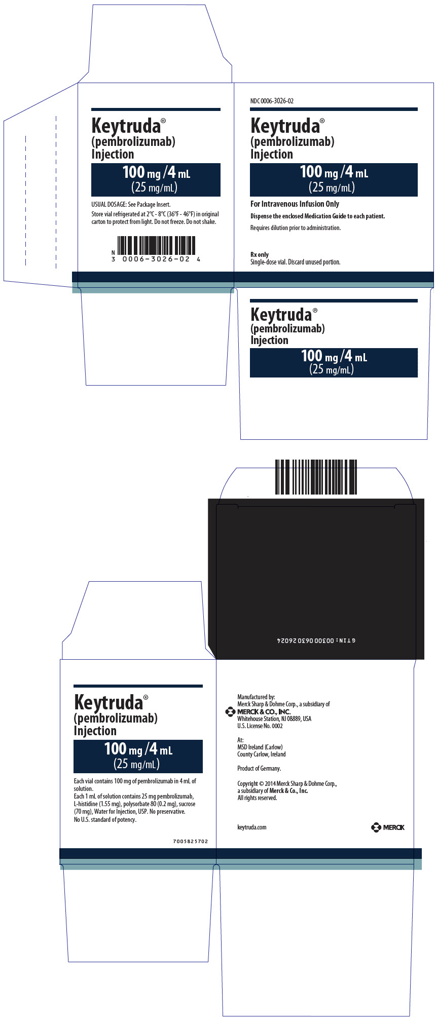
KEYTRUDA (pembrolizumab) Injection 100 mg/4 mL (25 mg/mL) carton label showing dosage strength, storage instructions, and manufacturer information. Label states it is for intravenous infusion only, single-dose vial. Manufactured by Merck Sharp & Dohme LLC, produced in Germany with facilities also in Ireland and the USA. Packaging includes dosage detail and a barcode.*

* About these descriptions: Image descriptions on this page are generated by automated AI analysis of the product label images from the manufacturer's FDA label submission (SPL). They are provided for reference only and may contain errors or omissions. Always rely on the printed label itself and the official FDA labeling, and consult a pharmacist or healthcare professional with any questions about this product.