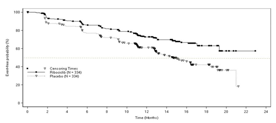
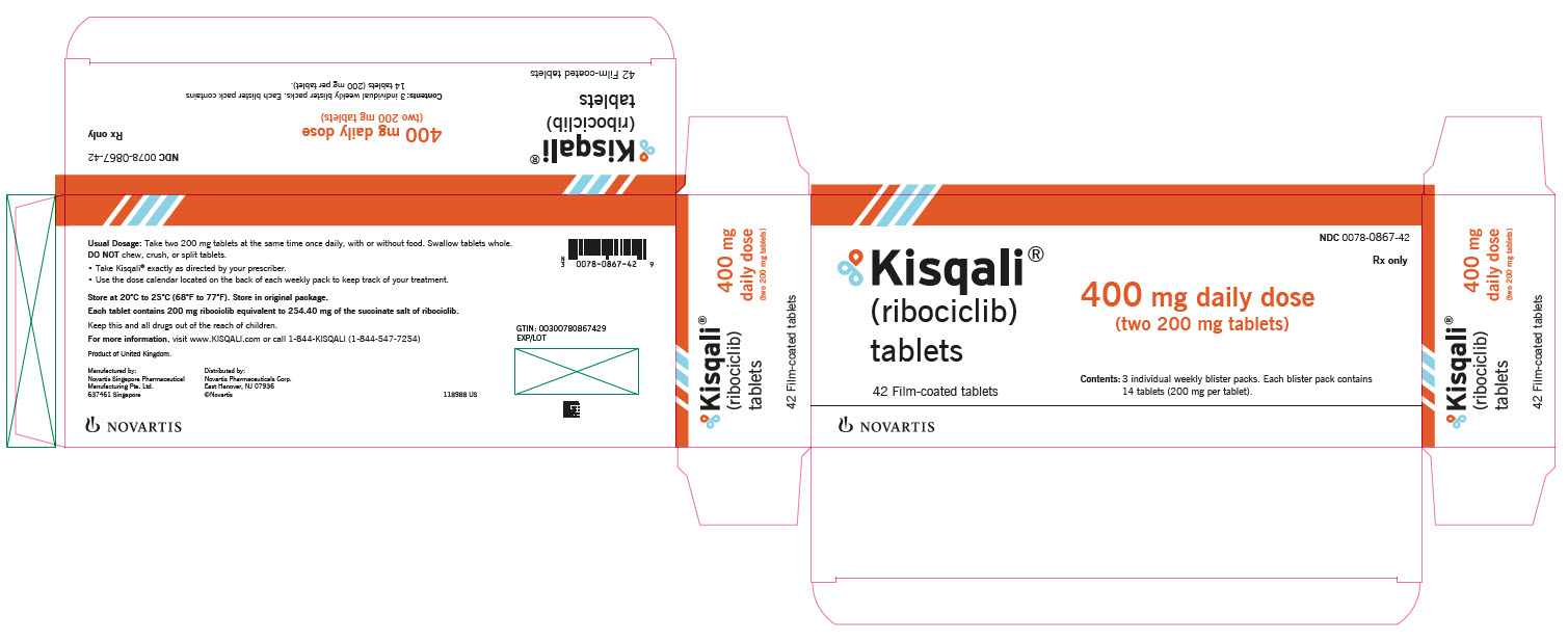
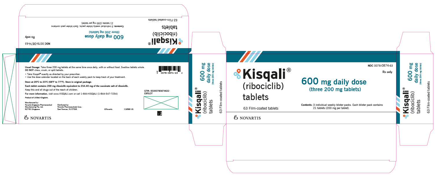
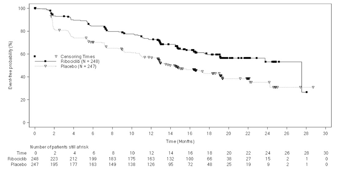
Kisqali Tablet, Film Coated
Product Images NDC 0078-0874
View Photos of Packaging, Regulatory Labels, and Product Appearance
Product Visual Gallery
This gallery contains 9 technical images submitted to the FDA as part of the official labeling for Kisqali (NDC 0078-0874). Unlike standard consumer photos, these assets often include clinical data figures, molecular chemical structures, and official manufacturer packaging layouts.
As provided by Novartis Pharmaceuticals Corporation, these visuals offer a comprehensive scientific overview of the product's physical and chemical identity, aiding pharmacists and researchers in product verification and study.
Product Images & Figures Index
Figure 1 Kaplan-meier Progression Free Survival Curves – Monaleesa-2 (intent-to-treat Population) (Kisqali 02)
This is a graph that shows the probability of an event (represented as a percentage) over time, based on two groups of participants: Ribociclib and Placebo. The participants were observed at different time intervals, marked on the X-axis. The Y-axis represents the likelihood of the event, with percentages ranging from 0 to 100. The data displays higher event probabilities in the Ribociclib group than the Placebo group.*
Principal Display Panel – Package Label – 200 mg Daily Dose (Kisqali 03)
The text is describing a package of tablets called Kisqali (ribociclib). The package contains 21 film-coated tablets, each containing 200mg of the drug. The tablets should be taken once daily with or without food and swallowed whole (not chewed, crushed, or spit). The package includes a dosing calendar to keep track of treatment.*
Principal Display Panel – Package Label – 400 mg Daily Dose (Kisqali 04)
This is an information about a drug called ribociclib, which is available in tablet form. The suggested daily dose is mentioned as 400 mg with a specific method of 2 tablets (each of 200 mg) consumption. This drug is produced by Novartis and comes in a package of 42 tablets. The rest of the text is not available as it contains errors.*
Principal Display Panel – Package Label – 600 mg Daily Dose (Kisqali 05)
Figure 2 Kaplan-meier Progression Free Survival Curves – Monaleesa-7 (nsai, Investigator Assessment) (Kisqali 06)
This seems to be a graph showing the results of a clinical trial comparing Ribociclib to a placebo treatment. The x-axis represents the time in months and the y-axis represents the number of patients still at risk. The text on the top left shows a calculation related to percentage. The specific results of the study cannot be determined as there is not enough information given.*
Figure 3 Kaplan-meier Overall Survival Curves- Monaleesa-7 (nsai) (Kisqali 07)
The text is a graph showing the number of patients still at risk over time in a clinical trial comparing ribociclib and placebo. The x-axis shows the time in months, while the y-axis shows the number of patients still at risk. The blue line represents the patients who received ribociclib, while the orange line represents those who received placebo. There were 248 patients in the ribociclib group and 247 in the placebo group.*
Figure 4 Kaplan-meier Progression Free Survival Curves – Monaleesa-3 (investigator Assessment) (Kisqali 08)
This appears to be a graph that compares the efficacy of two drugs in treating a certain medical condition. The drugs being compared are Ribociclib+Fulvesant and PlaceboFubestant. The x-axis shows the time elapsed in months while the y-axis indicates the number of patients who are still at risk. The data represented by the graph suggests that Ribociclib+Fulvesant is more effective in treating the medical condition compared to PlaceboFubestant. However, there is not enough context provided to be certain.*
Figure 5 Kaplan-meier Plot Of Overall Survival- Monaleesa-3 (intent-to-treat Population) (Kisqali 09)
This appears to be a graph displaying the number of patients still at risk over a period of 48 months. The graph compares the effects of Ribociclib+Fulvestrant versus PlacebosFulvestrant on 484 and 242 patients respectively. The vertical axis represents the number of patients still at risk while the horizontal axis represents time in months. At month zero, both groups start at full capacity, but gradually reduce over time. When the lines reach zero, it means that there are no patients left who are still at risk.*
* These product label images have been analyzed using experimental machine learning. Please verify findings with the primary label text.