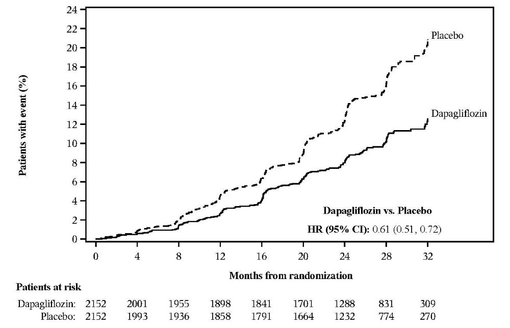
Figure 4 (Figure 4)

This appears to be a graph or chart related to the drug Dapagliflozin. It is showing the percentage of patients with an event over a period of time. However, without more context it is difficult to determine the exact nature of the events being measured. The graph displays the number of patients at risk for Dapagliflozin and a placebo at different increments of time.*