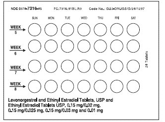
Figure 1 (2bb5d4df 72a9 4f35 80c1 D3634327b14a 01)

This appears to be a table showing the percentage of bleeding or spotting experienced at various points during a menstrual cycle. The cycles are divided into different lengths of time, and there are different percentages of bleeding or spotting for each cycle length. However, the output does not provide any additional context regarding what the data actually represents or what it is for.*