Docetaxel Injection, Solution, Concentrate
Product Images NDC 16729-267

View Photos of Packaging, Regulatory Labels, and Product Appearance

Product Visual Gallery

This gallery contains 14 technical images submitted to the FDA as part of the official labeling for Docetaxel (NDC 16729-267). Unlike standard consumer photos, these assets often include clinical data figures, molecular chemical structures, and official manufacturer packaging layouts.

As provided by Accord Healthcare Inc., these visuals offer a comprehensive scientific overview of the product's physical and chemical identity, aiding pharmacists and researchers in product verification and study.

FDA Label Image

Docetaxel Injection 160 mg Per 8 mL Carton

Docetaxel Injection 160 mg Per 8 mL Carton
Packaging label for Docetaxel Injection USP 160 mg/8 mL (20 mg/mL) by Accord Healthcare Inc. The label states it is ready to add to infusion solution, for intravenous infusion only, and is an 8 mL multiple dose vial. The label includes product NDC 16729-267-65 and storage instructions.*
FDA Label Image

Docetaxel Injection 20 mg Per mL Carton

Docetaxel Injection 20 mg Per mL Carton
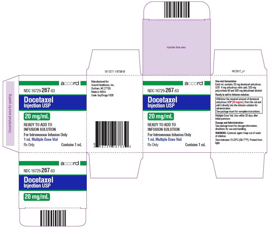
Packaging label for Docetaxel Injection USP 20 mg/mL by Accord Healthcare Inc. The label indicates a 1 mL multiple dose vial of ready-to-add infusion solution for intravenous infusion only. The label includes the NDC 16729-267-63, manufacturer details, dosage strength, and usage instructions emphasizing 20 mg/mL concentration and safe storage conditions.*
FDA Label Image

Docetaxel Injection 80 mg Per 4 mL Carton

Docetaxel Injection 80 mg Per 4 mL Carton
The image shows a carton label for Docetaxel Injection USP at 20 mg/mL (80 mg/4 mL) strength by Accord Healthcare Inc. The label indicates it is a ready-to-add intravenous infusion solution contained in a 4 mL multiple dose vial. It includes dosage form, concentration, instructions for infusion use, and storage conditions. Barcodes and NDC 16729-267-64 are visible.*
FDA Label Image

Docetaxel Injection (Docetaxel Injection Image01)

Docetaxel Injection (Docetaxel Injection Image01)
Chemical structure of docetaxel, showing its complex molecular arrangement including multiple rings, hydroxyl, methyl, and other functional groups as depicted in the diagram.*
FDA Label Image

Docetaxel Injection (Docetaxel Injection Image02)

Docetaxel Injection (Docetaxel Injection Image02)
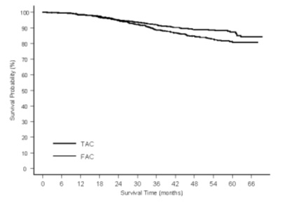
A line chart depicting disease-free survival (DFS) probability (%) over time in months, comparing two groups labeled TAC and FAC. The chart shows DFS probability decreasing over approximately 66 months, with the TAC group maintaining higher DFS probability than the FAC group throughout the period.*
FDA Label Image

Docetaxel Injection (Docetaxel Injection Image03)

Docetaxel Injection (Docetaxel Injection Image03)
A survival curve chart showing survival probability (%) over time in months for two groups labeled TAC and FAC. The graph compares survival trends between these two groups up to 66 months.*
FDA Label Image

Docetaxel (Docetaxel Injection Image04)

Docetaxel (Docetaxel Injection Image04)
A Kaplan-Meier survival curve chart comparing overall survival between two groups labeled T75 and BSC. The X-axis shows survival time in months from 0 to 21, and the Y-axis shows cumulative probability from 0.0 to 1.0. The graph highlights a statistically significant difference in overall survival with a log-rank p-value of 0.010.*
FDA Label Image

Docetaxel (Docetaxel Injection Image05)

Docetaxel (Docetaxel Injection Image05)
A Kaplan-Meier survival curve chart illustrating overall survival probability over time in months. The chart compares two groups labeled T75 and V/I, showing cumulative survival probabilities from 0 to 21 months, with a log-rank p-value of 0.13 indicating statistical comparison between the groups.*
FDA Label Image

Docetaxel Injection (Docetaxel Injection Image06)

Docetaxel Injection (Docetaxel Injection Image06)
A survival probability plot comparing two treatment groups labeled as T75 q3w and M q3w. The y-axis represents survival probability from 0.0 to 1.0, while the x-axis represents survival time in months from 0 to 30. The solid line corresponds to T75 q3w and the dashed line to M q3w, showing survival trends over time.*
FDA Label Image

Docetaxel (Docetaxel Injection Image07)

Docetaxel (Docetaxel Injection Image07)
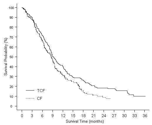
A Kaplan-Meier survival curve chart depicting probability (%) over time in months comparing two treatment groups labeled TCF and CF. The chart shows survival probability decreasing over a 24-month period for both groups.*
FDA Label Image

Docetaxel (Docetaxel Injection Image08)

Docetaxel (Docetaxel Injection Image08)
A survival probability line graph showing two curves labeled TCF (solid line) and CF (dotted line) plotted against survival time in months (0 to 36 months) on the x-axis and survival probability percentage (0% to 100%) on the y-axis. The graph compares survival probabilities over time for two groups.*
FDA Label Image

Docetaxel Injection (Docetaxel Injection Image09)

Docetaxel Injection (Docetaxel Injection Image09)
A Kaplan-Meier curve comparing progression-free survival (PFS) probability over time in months for two treatment groups labeled TPF (solid line) and PF (dotted line). The graph shows PFS probability percentage on the vertical axis and months on the horizontal axis, illustrating survival trends for each group over approximately 42 months.*
FDA Label Image

Docetaxel Injection (Docetaxel Injection Image10)

Docetaxel Injection (Docetaxel Injection Image10)
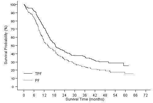
A survival plot graph showing survival probability (%) on the Y-axis versus survival time in months on the X-axis, with two curves labeled TPF and PF representing different treatment groups over a period of up to 72 months.*
FDA Label Image

Docetaxel Injection (Docetaxel Injection Image11)

Docetaxel Injection (Docetaxel Injection Image11)
A survival probability Kaplan-Meier curve chart comparing two groups: TPF (n=255) and PF (n=246), showing survival time in months on the x-axis and survival probability percentage on the y-axis. The chart displays that the TPF group generally has a higher survival probability over time compared to the PF group, with patient counts at risk listed below the x-axis at various time points.*

* About these descriptions: Image descriptions on this page are generated by automated AI analysis of the product label images from the manufacturer's FDA label submission (SPL). They are provided for reference only and may contain errors or omissions. Always rely on the printed label itself and the official FDA labeling, and consult a pharmacist or healthcare professional with any questions about this product.