Atomfig1 (Atomfig1)
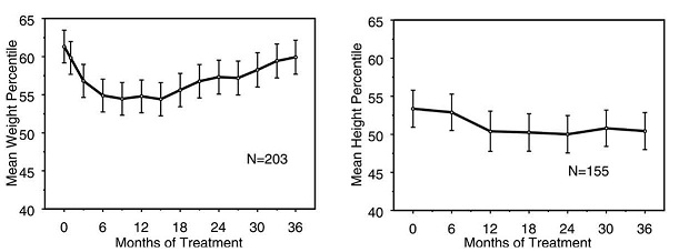
This appears to be a chart showing the mean height percentage over time for two different groups (N=203 and N=155) receiving treatment for a certain condition. The X-axis represents the duration of treatment in months and the Y-axis shows the percentage of mean height. However, without further context, it is difficult to provide a more informative description.*