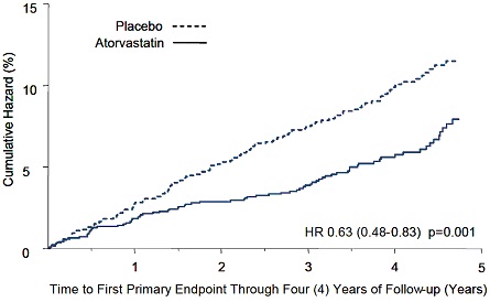
Fig 1 (Atorvastatinfig1)
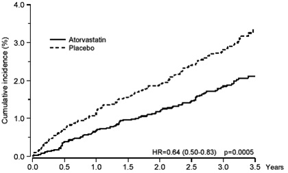
This appears to be a graph showing the cumulative incidence of something, possibly a medical condition or side effect of a medication. The graph includes two lines, one labeled "Atorvastatin" and the other labeled "Placebo." The x-axis displays years, and the y-axis displays percentages ranging from 0 to 40. The graph seems to suggest that the incidence of the condition is lower in patients taking Atorvastatin compared to those taking a placebo, with a statistically significant difference indicated by the HR value and p-value.*