Clopidogrel Tablet, Film Coated
Product Images NDC 50268-184

10 FDA label images from Avpak · Packaging, Regulatory Labels, and Product Appearance

Product Visual Gallery

This gallery contains 10 technical images submitted to the FDA as part of the official labeling for Clopidogrel (NDC 50268-184). Unlike standard consumer photos, these assets often include clinical data figures, molecular chemical structures, and official manufacturer packaging layouts.

As provided by Avpak, these visuals offer a comprehensive scientific overview of the product's physical and chemical identity, aiding pharmacists and researchers in product verification and study.

FDA Label Image

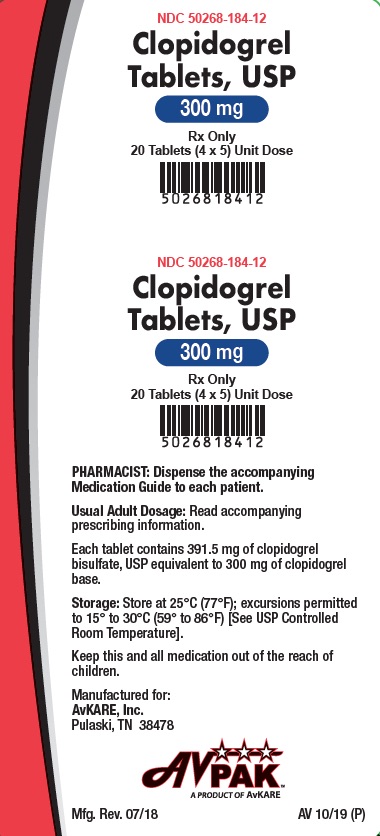
300mg (184 12)

300mg (184 12)
Label for Clopidogrel 300 mg tablets, USP, film-coated oral tablets supplied as 20 tablets (4 x 5) unit dose. The label shows the product name, strength, quantity, and manufacturer AvPAK, a product of AvKARE. It includes storage instructions and a note for the pharmacist to dispense the accompanying medication guide.*
FDA Label Image

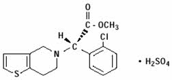
Chemical Structure (Clopidogrel 01)

Chemical Structure (Clopidogrel 01)
Chemical structure of clopidogrel bisulfate, showing the molecular arrangement of atoms including a thiophene ring, methyl ester group, and bisulfate component.*
FDA Label Image

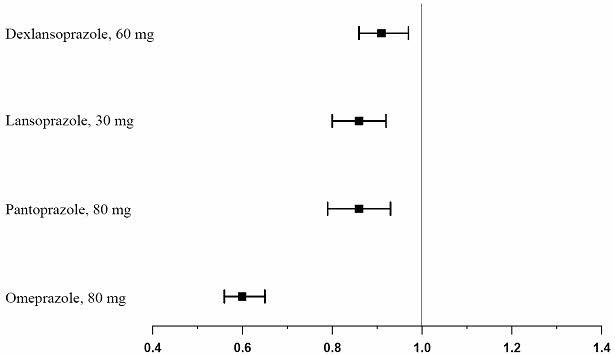
Figure 1 (Clopidogrel 02)

Figure 1 (Clopidogrel 02)
A horizontal error bar plot comparing four drugs—Dexlansoprazole 60 mg, Lansoprazole 30 mg, Pantoprazole 80 mg, and Omeprazole 80 mg. The x-axis shows a numeric scale from 0.4 to 1.4, with each drug represented by a point estimate and corresponding error bars indicating variability or confidence intervals.*
FDA Label Image

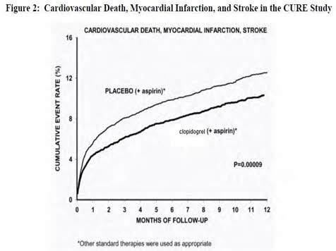
Figure 2 (Clopidogrel 03)

Figure 2 (Clopidogrel 03)
A line graph titled 'Cardiovascular Death, Myocardial Infarction, and Stroke in the CURE Study' showing cumulative event rates over 12 months of follow-up. Two lines compare placebo (+ aspirin) and clopidogrel (+ aspirin) treatments, with clopidogrel showing a lower cumulative event rate. The graph includes a p-value of 0.00009 indicating statistical significance.*
FDA Label Image

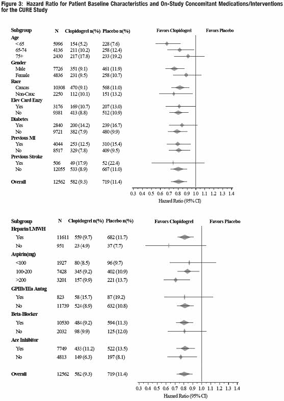
Figure 3 (Clopidogrel 04)

Figure 3 (Clopidogrel 04)
A figure titled 'Hazard Ratio for Patient Baseline Characteristics and On-Study Concomitant Medications/Interventions for the CURE Study.' The chart compares hazard ratios with 95% confidence intervals for various subgroups including age, gender, race, diabetes, previous myocardial infarction, and use of concomitant medications (heparin/LMWH, aspirin, GP IIb/IIIa antagonists, beta-blockers, ACE inhibitors), displaying the effect of Clopidogrel versus placebo on these groups. Data are presented as hazard ratios plotted along a horizontal axis with markers indicating favorability toward Clopidogrel or placebo.*
FDA Label Image

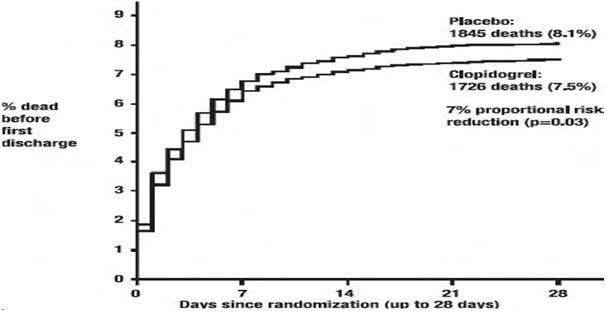
Figure 4 (Clopidogrel 05)

Figure 4 (Clopidogrel 05)
A line graph showing the percentage of deaths before first discharge over a 28-day period since randomization. It compares death rates between placebo and Clopidogrel groups, with placebo having 1845 deaths (8.1%) and Clopidogrel having 1726 deaths (7.5%). The graph indicates a 7% proportional risk reduction favoring Clopidogrel (p=0.03).*
FDA Label Image

Figure 5 (Clopidogrel 06)

Figure 5 (Clopidogrel 06)
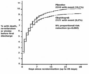
A line graph showing the percentage of patients with death, re-infarction, or stroke before first discharge over 28 days since randomization. Two curves compare Placebo (10.1% event rate) and Clopidogrel (9.2% event rate), indicating a 9% proportional risk reduction with Clopidogrel.*
FDA Label Image

Figure 6 (Clopidogrel 07)

Figure 6 (Clopidogrel 07)
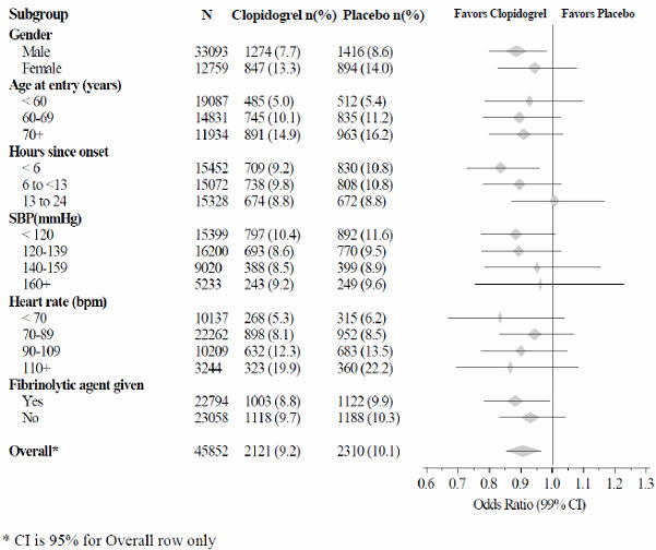
A forest plot chart illustrating odds ratios with 99% confidence intervals for various subgroups comparing Clopidogrel versus placebo. Subgroups include gender, age at entry, hours since onset, systolic blood pressure, heart rate, and fibrinolytic agent use, with overall results summarized at the bottom. The x-axis represents the odds ratio scale ranging approximately from 0.6 to 1.3.*
FDA Label Image

Figure 7 (Clopidogrel 08)

Figure 7 (Clopidogrel 08)
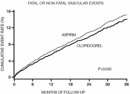
A line graph depicting the cumulative event rate (%) of fatal or non-fatal vascular events over 36 months of follow-up, comparing Aspirin and Clopidogrel. The x-axis represents months of follow-up, and the y-axis shows cumulative event rate percentage. Two lines indicate event rates for Aspirin and Clopidogrel, with a p-value of 0.045 noted on the graph.*
FDA Label Image

Figure 8 (Clopidogrel 09)

Figure 8 (Clopidogrel 09)
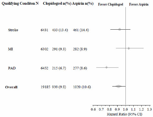
A forest plot chart comparing the hazard ratio between Clopidogrel and Aspirin across four conditions: Stroke, MI (Myocardial Infarction), PAD (Peripheral Artery Disease), and overall. The chart indicates the number of events and percentage for each condition under Clopidogrel and Aspirin, with a horizontal axis showing hazard ratios ranging approximately from 0.6 to 1.3, and points representing favor towards Clopidogrel or Aspirin based on confidence intervals.*

* About these descriptions: Image descriptions on this page are generated by automated AI analysis of the product label images from the manufacturer's FDA label submission (SPL). They are provided for reference only and may contain errors or omissions. Always rely on the printed label itself and the official FDA labeling, and consult a pharmacist or healthcare professional with any questions about this product.