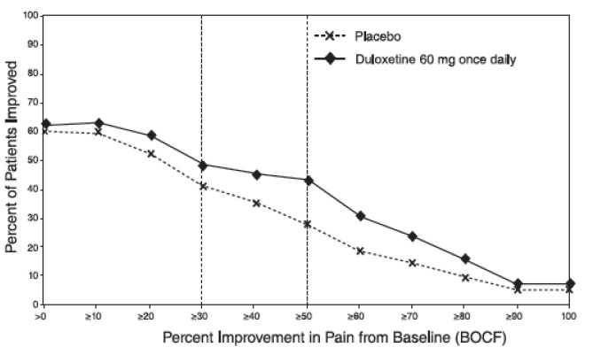
Figure1.jpg (Figure1)

This is a graph showing the proportion of patients with relapse over time from randomization to relapse (in days) for a treatment of placebo versus duloxetine. The x-axis represents the time in days, and the y-axis shows the proportion of patients with relapse. However, without more contextual information, it is unclear what this graph pertains to or what the treatment and relapse refer to.*