Ticagrelor Tablet
Product Images NDC 51407-861

View Photos of Packaging, Regulatory Labels, and Product Appearance

Product Visual Gallery

This gallery contains 20 technical images submitted to the FDA as part of the official labeling for Ticagrelor (NDC 51407-861). Unlike standard consumer photos, these assets often include clinical data figures, molecular chemical structures, and official manufacturer packaging layouts.

As provided by Golden State Medical Supply, Inc., these visuals offer a comprehensive scientific overview of the product's physical and chemical identity, aiding pharmacists and researchers in product verification and study.

FDA Label Image

51407-861-60lb (Ticagrelor 90 mg)
51407-861-60lb (Ticagrelor 90 mg)
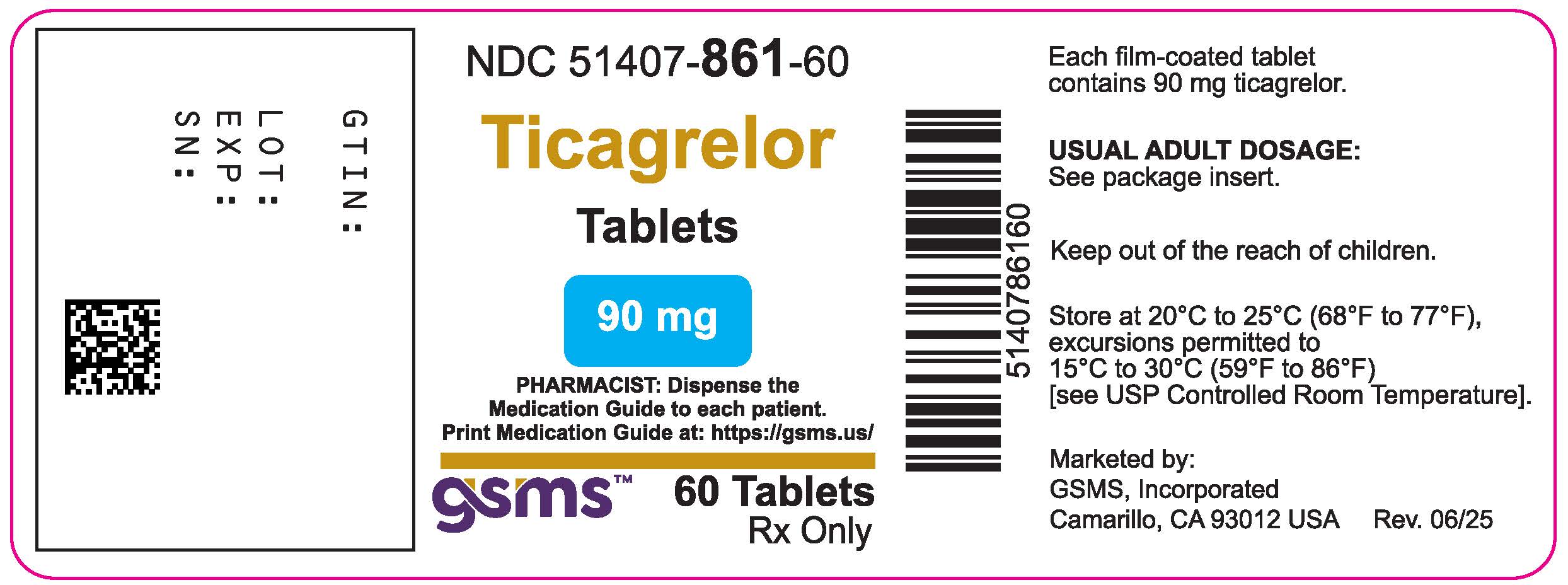
Label for Ticagrelor 90 mg tablets, an oral prescription drug by Golden State Medical Supply, Inc. The label shows the product name, strength, dosage form, and quantity of 60 tablets. It includes a barcode, storage instructions, usual adult dosage note, and pharmacist guidance. The label also displays lot, expiration, and serial number fields along with the GSMS logo.*
FDA Label Image

Figure1.jpg (Figure1)

Figure1.jpg (Figure1)
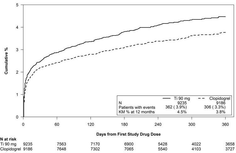
This line graph compares the cumulative percentage of events over 360 days from the first study drug dose between Ticagrelor 90 mg and Clopidogrel. The x-axis shows days from the first dose, and the y-axis shows cumulative percentage. Data include patient numbers at risk over time and event counts for each drug.*
FDA Label Image

Figure10.jpg (Figure10)

Figure10.jpg (Figure10)
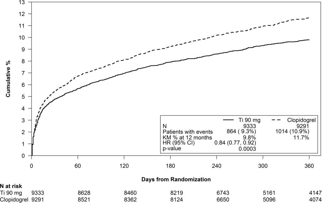
A Kaplan-Meier cumulative event percentage graph comparing Ticagrelor 90 mg oral tablets versus Clopidogrel over 360 days from randomization. The y-axis shows cumulative % events and the x-axis shows days from randomization. The graph includes patient counts at risk over time and a key with hazard ratio, confidence interval, and p-value data.*
FDA Label Image

Figure11.jpg (Figure11)

Figure11.jpg (Figure11)
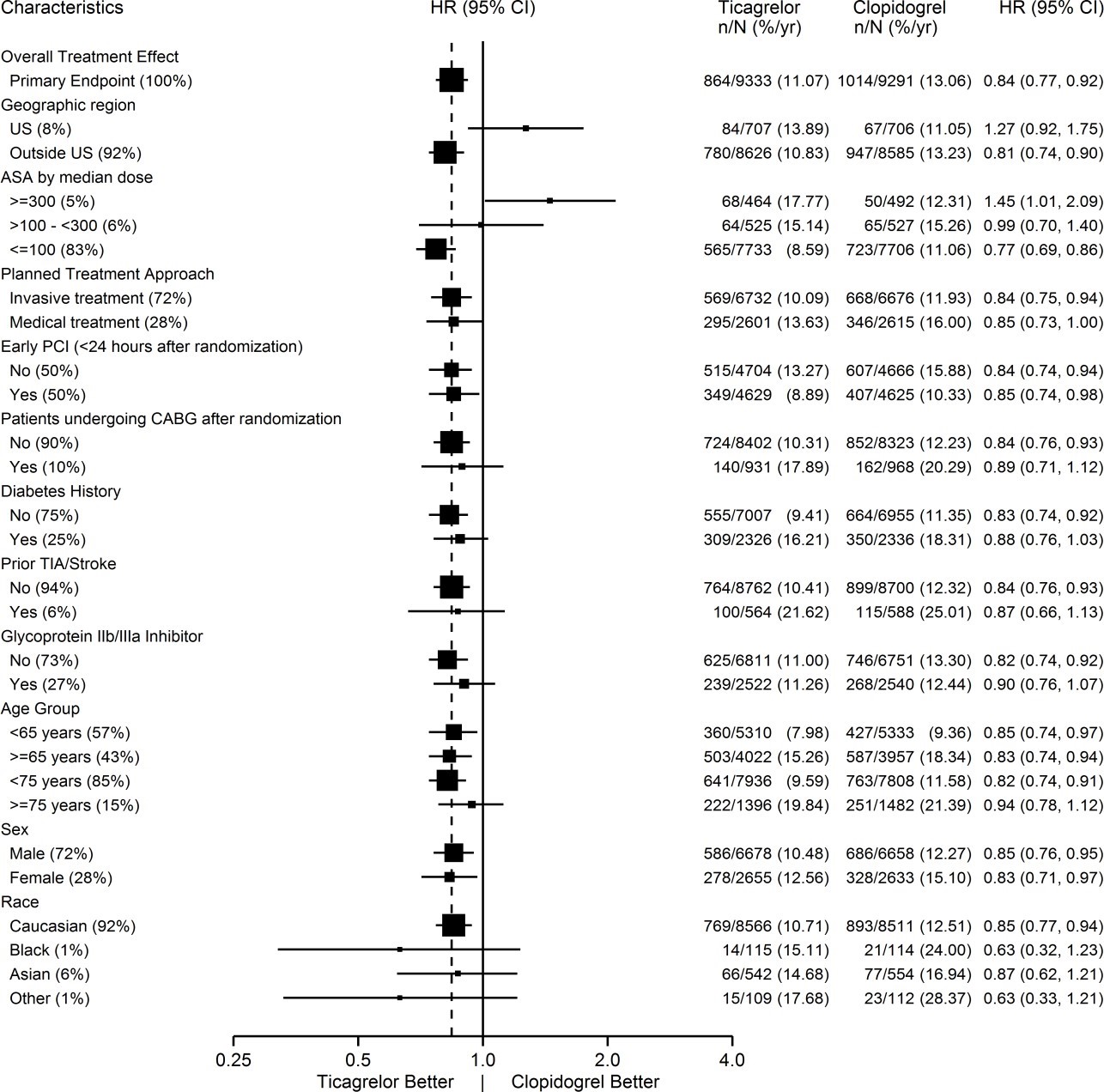
A forest plot comparing the hazard ratios (HR) and 95% confidence intervals for Ticagrelor versus Clopidogrel across various patient characteristics. The plot includes subgroups such as geographic region, ASA dose, treatment approach, PCI timing, diabetes history, age groups, sex, and race with corresponding event rates, showing relative efficacy between Ticagrelor and Clopidogrel.*
FDA Label Image

Figure12.jpg (Figure12)

Figure12.jpg (Figure12)
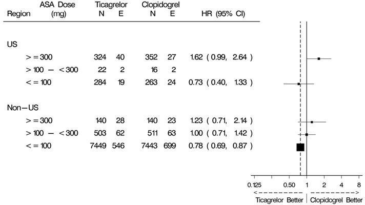
A data table comparing hazard ratios (HR) with 95% confidence intervals (CI) between Ticagrelor and Clopidogrel at different ASA dose levels (<=100 mg, >100 to <300 mg, >=300 mg) across US and non-US regions. The table includes sample sizes (N) and events (E) for each treatment group, accompanied by a forest plot illustrating the HR estimates and confidence intervals.*
FDA Label Image

Figure13.jpg (Figure13)

Figure13.jpg (Figure13)
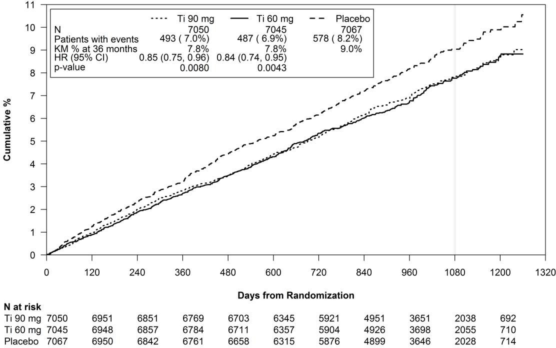
A cumulative percentage line graph showing event rates over time from randomization (days) for Ticagrelor 90 mg, Ticagrelor 60 mg, and placebo groups. The graph includes survival curves with event counts, hazard ratios, and p-values for each treatment group, alongside a table indicating numbers at risk over time.*
FDA Label Image

Figure14.jpg (Figure14)

Figure14.jpg (Figure14)
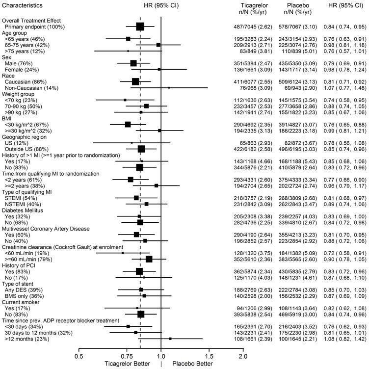
A forest plot chart depicting hazard ratios (HR) with 95% confidence intervals comparing Ticagrelor and placebo across various patient characteristics, including age, sex, race, weight group, BMI, geographic region, medical history, type of myocardial infarction, diabetes status, stent history, smoking status, and duration of prior ADP receptor blocker treatment. The x-axis indicates effectiveness ranging from Ticagrelor better to placebo better.*
FDA Label Image

Figure15.jpg (Figure15)

Figure15.jpg (Figure15)
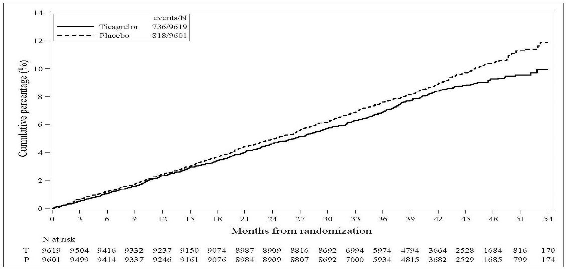
A line graph comparing the cumulative percentage of events over months from randomization between Ticagrelor and Placebo groups. The x-axis represents months ranging from 0 to 54, and the y-axis shows cumulative percentage from 0% to 14%. The graph includes event counts for each group: 736/9619 for Ticagrelor and 818/9601 for Placebo. Risk numbers at various months are provided below the graph for both groups.*
FDA Label Image

Figure16.jpg (Figure16)

Figure16.jpg (Figure16)
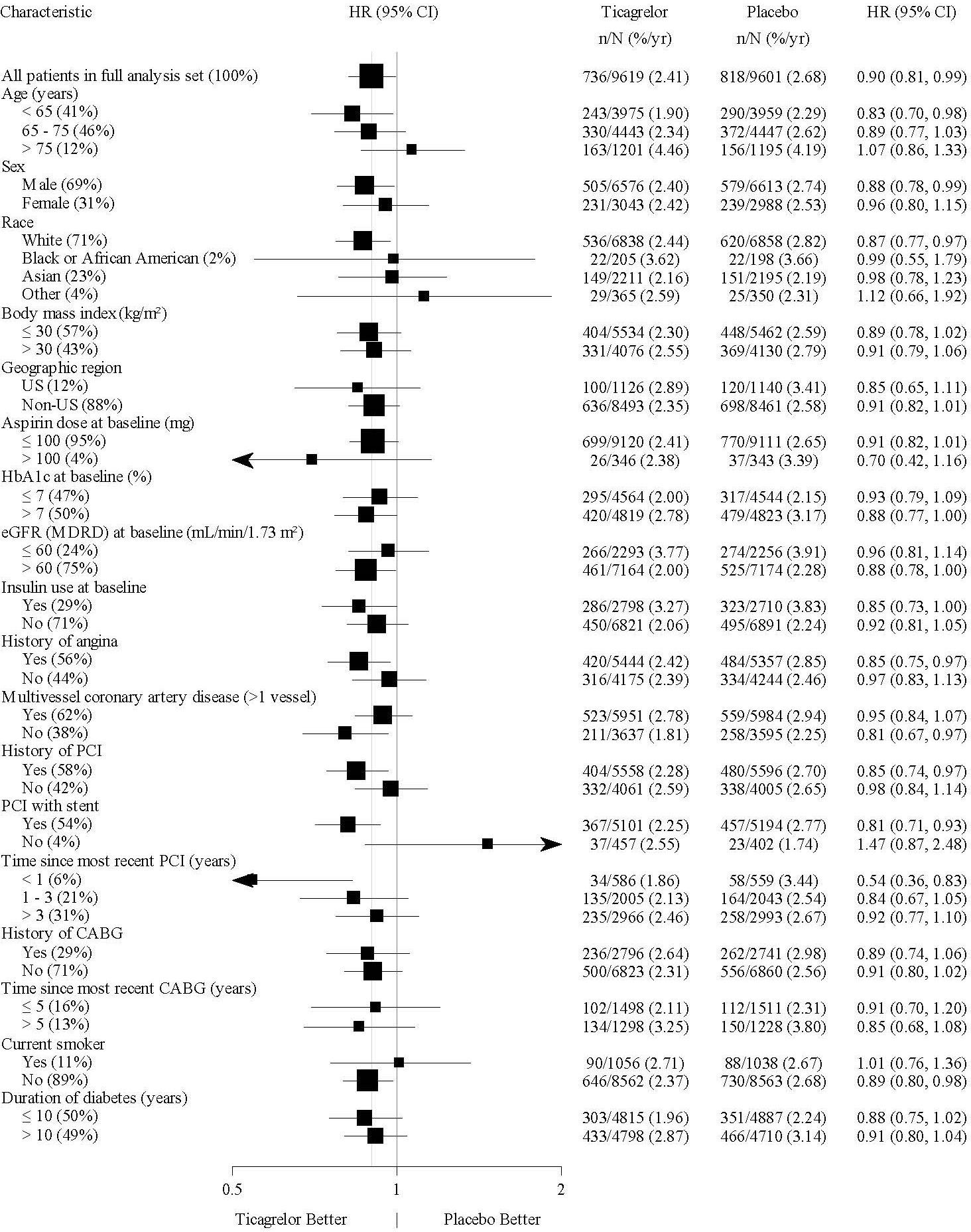
A forest plot comparing hazard ratios (HR) with 95% confidence intervals for various patient characteristics between Ticagrelor and placebo groups. The plot includes subgroups by age, sex, race, body mass index, geographic region, aspirin dose, and medical history factors, illustrating relative outcomes of Ticagrelor versus placebo.*
FDA Label Image

Figure17.jpg (Figure17)

Figure17.jpg (Figure17)
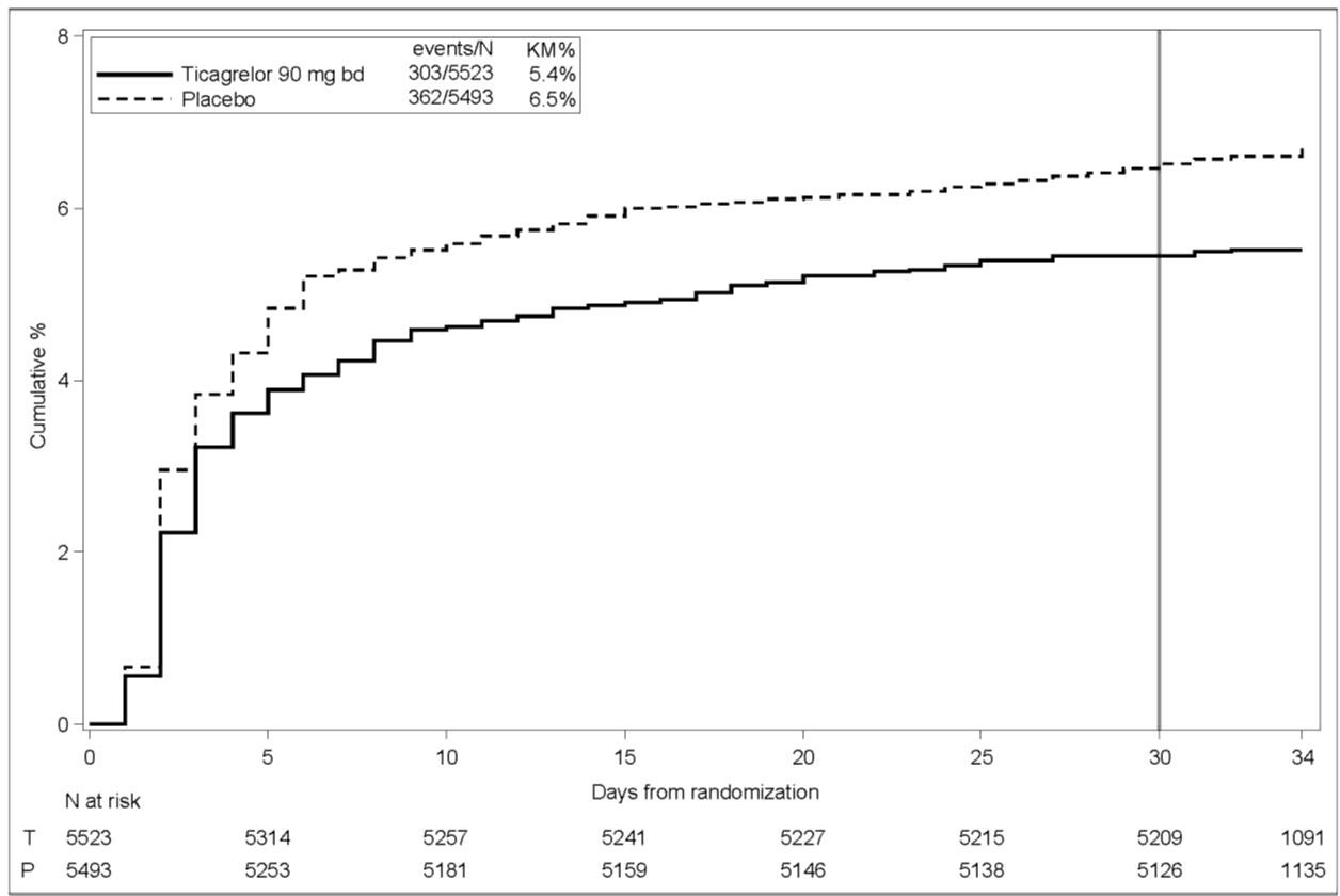
A Kaplan-Meier cumulative percentage curve showing event rates over days from randomization for Ticagrelor 90 mg twice daily versus placebo. The graph displays cumulative percentages on the y-axis and days from 0 to 34 on the x-axis, with Ticagrelor represented by a solid line and placebo by a dashed line. A table below lists the number at risk for each group over time.*
FDA Label Image

Figure18.jpg (Figure18)

Figure18.jpg (Figure18)
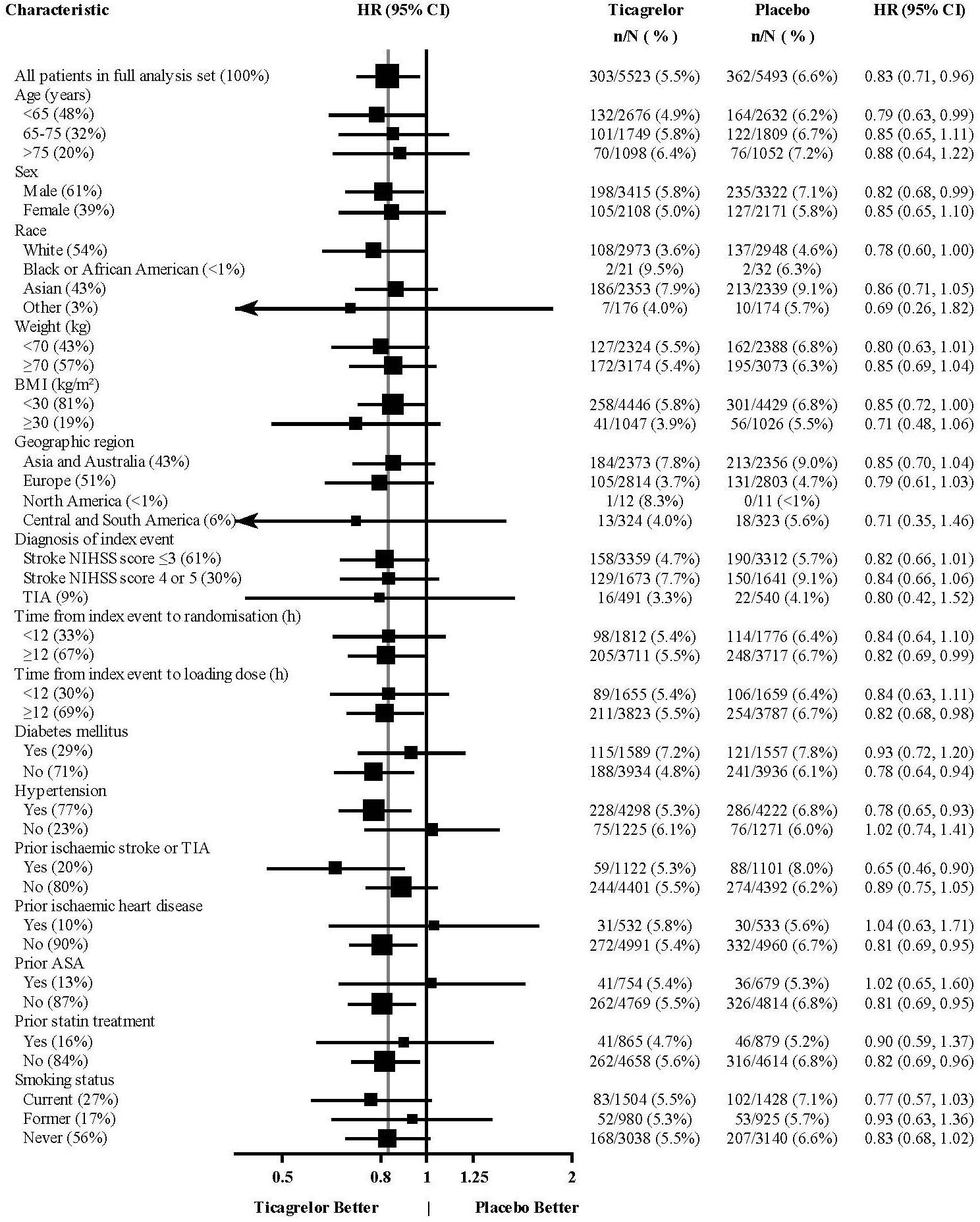
A forest plot showing hazard ratios (HR) and 95% confidence intervals (CI) comparing Ticagrelor 90 mg tablet to placebo across multiple patient characteristics, including age, sex, race, weight, BMI, geographic region, diagnosis, time from event to randomization, diabetes status, hypertension, prior stroke, heart disease, ASA use, statin treatment, and smoking status. The plot visually indicates subgroups where Ticagrelor performs better or worse compared to placebo.*
FDA Label Image

Figure2.jpg (Figure2)

Figure2.jpg (Figure2)
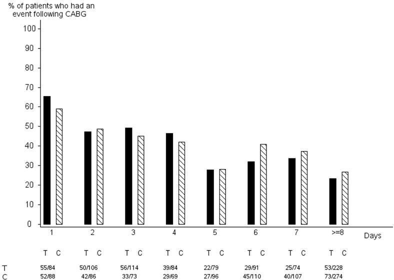
A bar chart comparing the percentage of patients who had an event following coronary artery bypass grafting (CABG) over several days for two groups labeled T and C. The vertical axis shows the percentage of patients, and the horizontal axis shows days numbered 1 through 8 or more. Values for each group are displayed below the chart, indicating patient counts for corresponding days.*
FDA Label Image

Figure3.jpg (Figure3)

Figure3.jpg (Figure3)
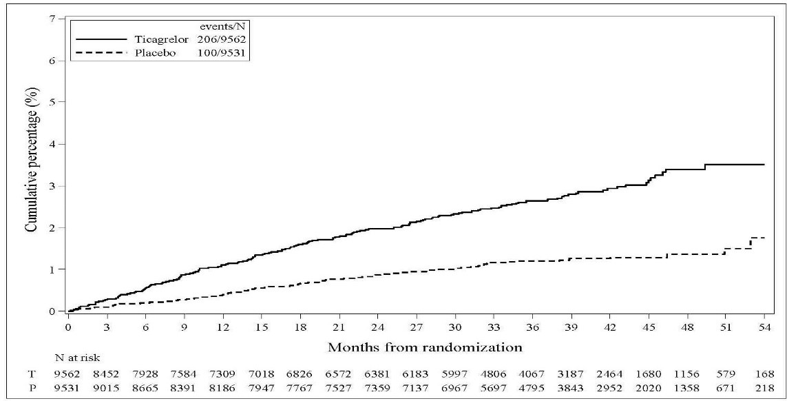
A cumulative percentage line chart comparing events over months from randomization between Ticagrelor and placebo groups. The y-axis shows cumulative percentage (0-7%), and the x-axis shows months (0-54). The solid line represents Ticagrelor with higher cumulative percentage than the dashed placebo line. Risk table below lists subjects at risk each time point.*
FDA Label Image

Figure4.jpg (Figure4)

Figure4.jpg (Figure4)
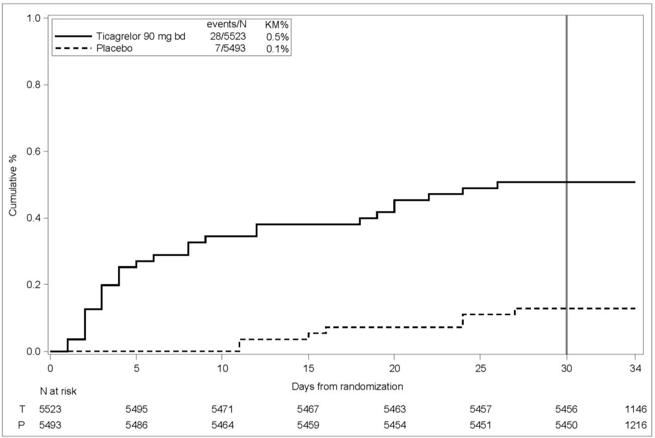
A Kaplan-Meier cumulative percentage curve comparing Ticagrelor 90 mg twice daily (solid line) versus placebo (dashed line) over 34 days from randomization. The graph includes event counts and risk numbers at various time points, illustrating cumulative events for the two groups in a clinical study context.*
FDA Label Image

Figure5.jpg (Figure5)

Figure5.jpg (Figure5)
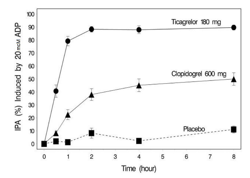
A line graph depicting IPA (%) induced by 20 µM ADP over time (0 to 8 hours) for Ticagrelor 180 mg, Clopidogrel 600 mg, and placebo. Ticagrelor shows a rapid increase reaching about 90% IPA by 2 hours remaining steady, Clopidogrel increases gradually to around 50%, and placebo remains near baseline throughout.*
FDA Label Image

Figure6.jpg (Figure6)

Figure6.jpg (Figure6)
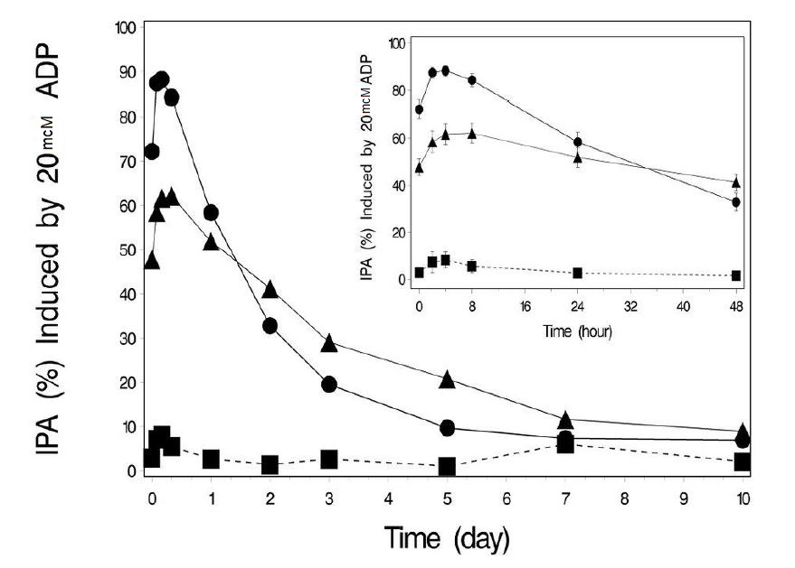
A graph showing Inhibition of Platelet Aggregation (IPA) percentage induced by 20 mcM ADP over time in days, with a smaller inset graph showing IPA over hours. Multiple data series are plotted with different markers, illustrating the IPA response trends over the specified periods.*
FDA Label Image

Figure7.jpg (Figure7)

Figure7.jpg (Figure7)
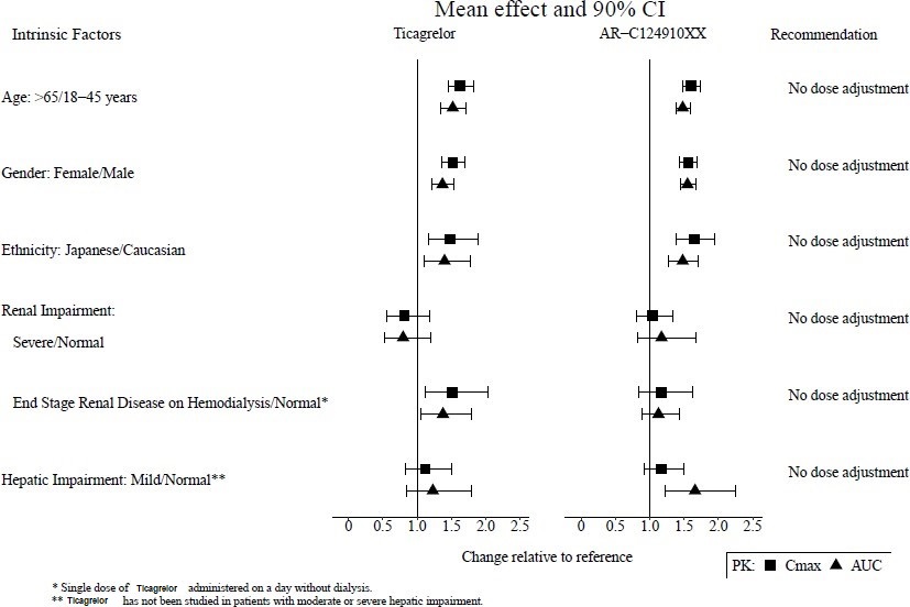
A chart showing the mean effect and 90% confidence intervals for Ticagrelor and AR-C124910XX across intrinsic factors such as age, gender, ethnicity, renal impairment, end-stage renal disease on hemodialysis, and mild hepatic impairment. The graph compares changes relative to reference with Cmax and AUC values, accompanied by dosage adjustment recommendations, all indicating no dose adjustment needed for these factors.*
FDA Label Image

Figure8.jpg (Figure8)

Figure8.jpg (Figure8)
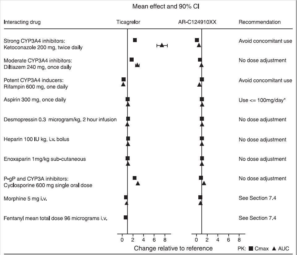
A chart titled 'Mean effect and 90% CI' presenting drug interaction data for Ticagrelor and AR-C124910XX. The left column lists interacting drugs including CYP3A4 inhibitors, inducers, aspirin, and others with their dosages. Two side-by-side vertical line graphs show change relative to reference values along the x-axis with markers for Cmax and AUC. The right column provides recommendations, such as avoiding concomitant use or no dose adjustment needed.*
FDA Label Image

Figure9.jpg (Figure9)

Figure9.jpg (Figure9)
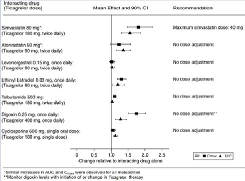
A forest plot chart showing the interaction effects of Ticagrelor doses on various drugs including Simvastatin, Atorvastatin, Levonorgestrel, Ethinyl Estradiol, Tolbutamide, Digoxin, and Cyclosporine. The x-axis represents the change relative to the interacting drug alone, with mean effects and 90% confidence intervals displayed as black squares and lines, along with dosing recommendations for each drug.*
FDA Label Image

Structure.jpg (Structure)

Structure.jpg (Structure)
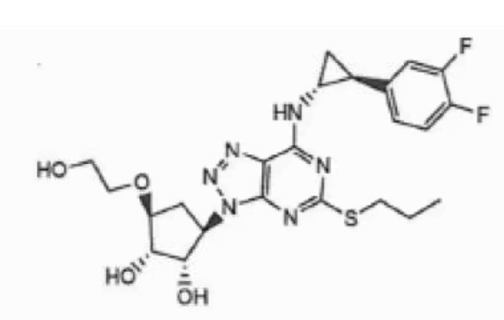
Chemical structure of Ticagrelor, showing its molecular components including hydroxyl groups, a cyclopropyl group, fluorinated phenyl rings, and a thioether linkage.*

* About these descriptions: Image descriptions on this page are generated by automated AI analysis of the product label images from the manufacturer's FDA label submission (SPL). They are provided for reference only and may contain errors or omissions. Always rely on the printed label itself and the official FDA labeling, and consult a pharmacist or healthcare professional with any questions about this product.