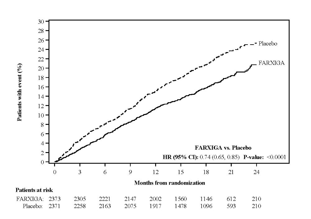
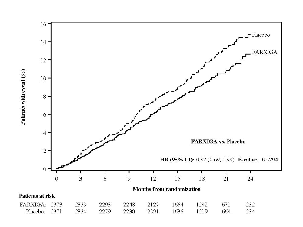
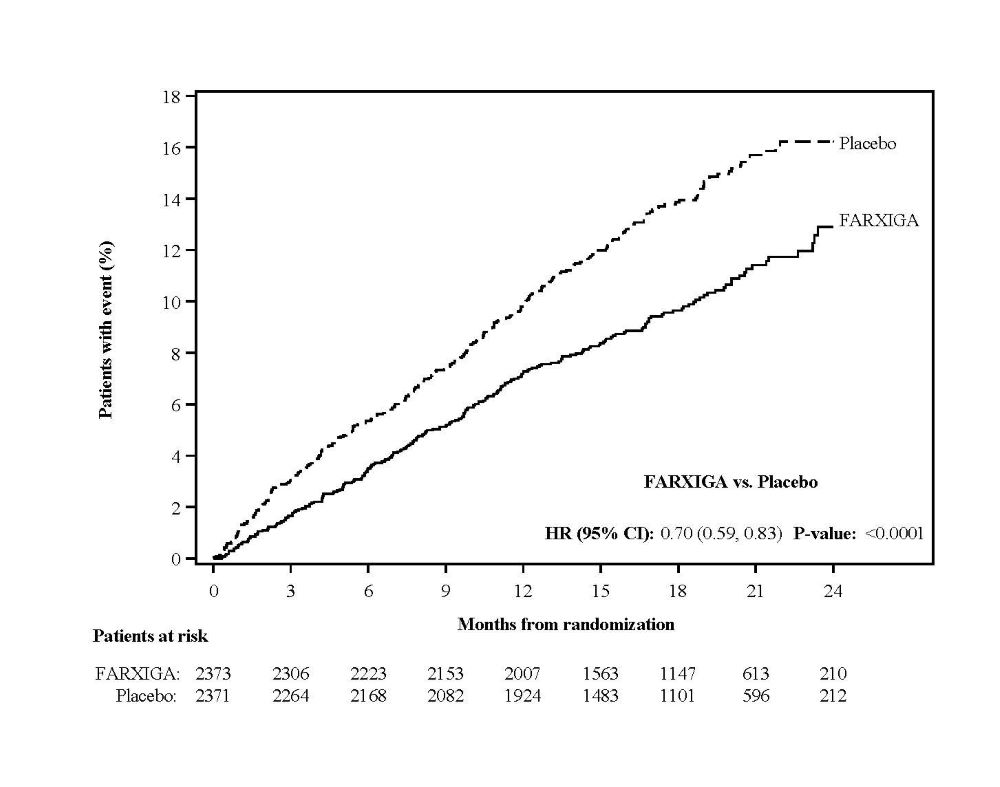
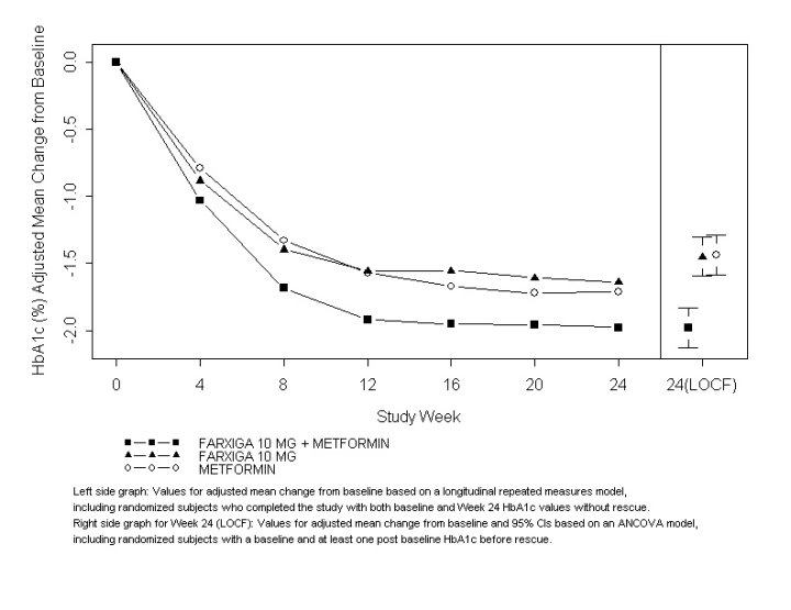
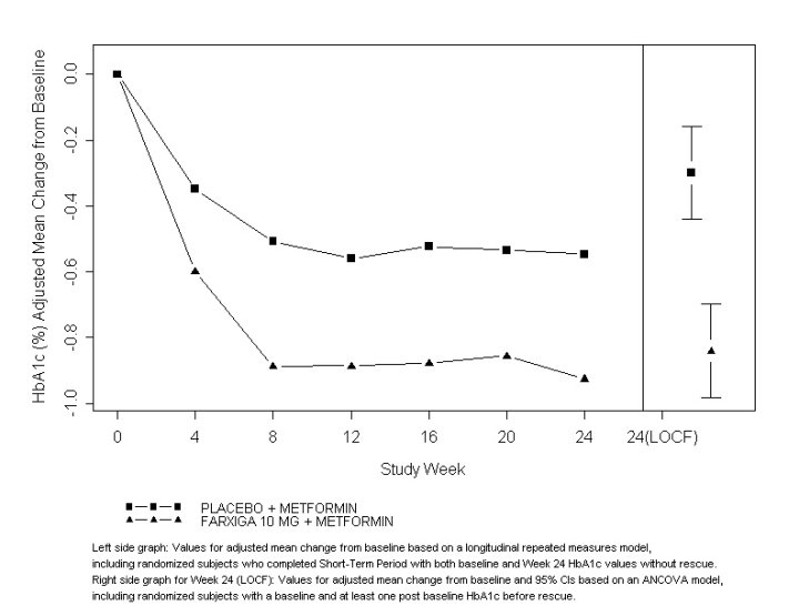
Figure 4
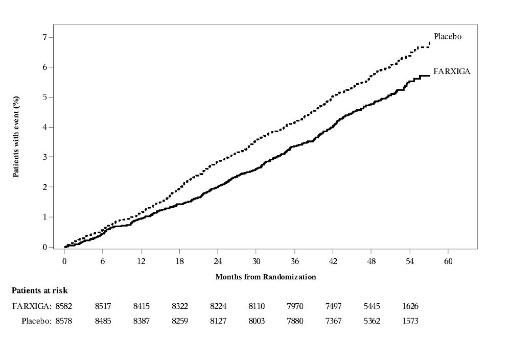
This appears to be a chart or graph that shows the percentage of patients who experienced an event over time (measured in months) for a treatment called FARXIGA versus a placebo. The number of patients at risk for each group is provided. However, without more information on what the "event" being measured is and what FARXIGA is used to treat, it's difficult to provide a more specific description.*