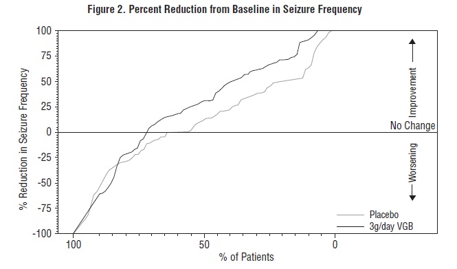
Figure 1 (Vigabatrin Fig1)

This appears to be a graph displaying the percentage reduction in seizure frequency for different treatment groups. The treatments are referred to as Plcsbo, Tolday, aglday V68, and bgiday. The x-axis displays the percentage of patients in the treatment group and the y-axis shows the percent reduction in seizure frequency. The graph shows three groups with varying degrees of improvement, no change or worsening. No further context is available to interpret the origin, purpose, or nature of the data.*