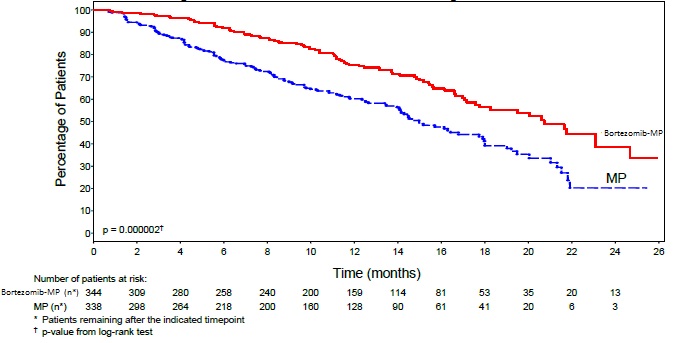
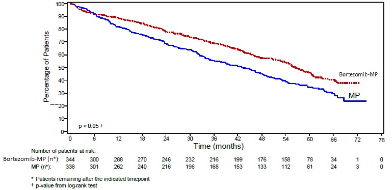
Figure6 (Figure6)

The provided text represents a survival curve comparison between two treatment groups (VGR-CAP and R-CHOP) for a certain medical condition. The curve shows the percentage of subjects that were still alive during a certain period of time (in months) after receiving treatment. Unfortunately, the numbers and characters in the text do not represent a clear description and cannot be interpreted without more information.*