Figure 1 (Figure 1)
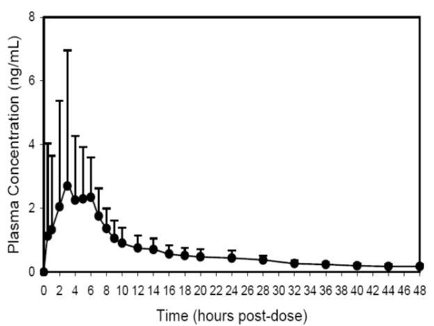
This appears to be a graph showing plasma concentration (in ng/mL) of a substance over time (in hours post-dose). The x-axis shows the time post-dose in hours, while the y-axis shows the concentration levels in ng/mL. The concentration starts at 0 and gradually increases over time. There are specific time points marked on the x-axis as 2, 4, 6, 8, 10, 12, 14, 16, 18, 20, 22, 24, 26, 28, 30, 32, 34, 36, 38, 40, 42, 44, 46, and 48 hours.*