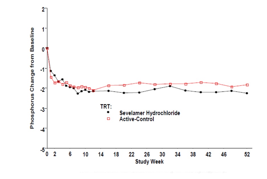
Figure 3 (Figure 2)
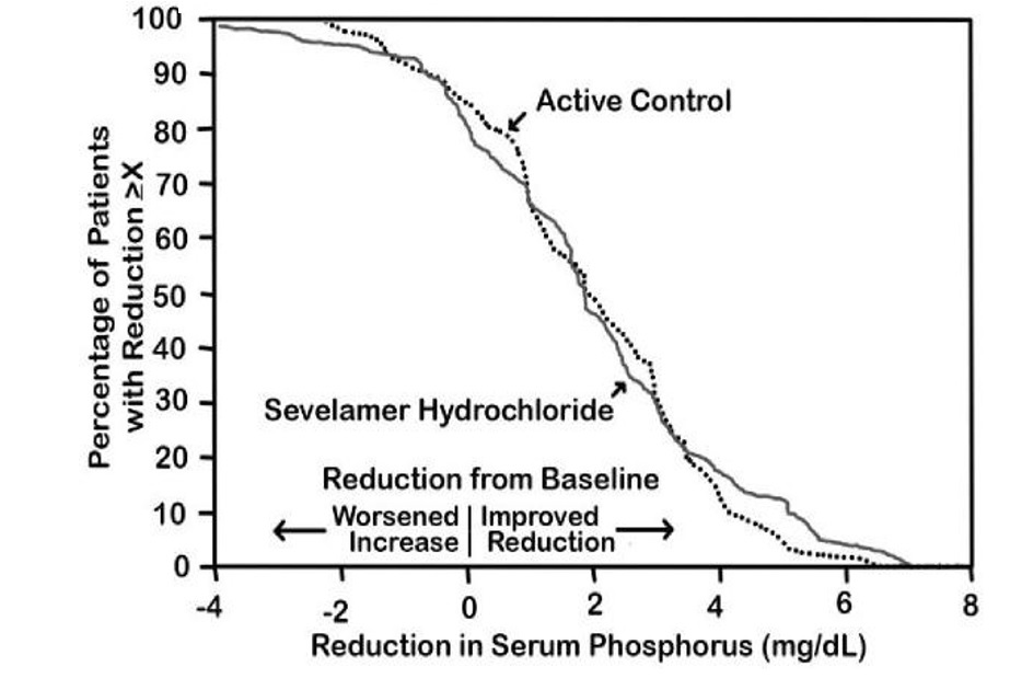
This appears to be a graph showing the effect of Sevelamer Hydrochloride on serum phosphorus, with reductions shown on the Y-axis and the reduction in serum phosphorus in milligrams per deciliter shown on the X-axis. There are several data points indicating improvement or worsening, with a range of reductions shown from 0 to 10. There is also a legend indicating "Active Control" and various values for reduction or improvement.*