Farxiga Tablet, Film Coated
Product Images NDC 70518-4614

View Photos of Packaging, Regulatory Labels, and Product Appearance

Product Visual Gallery

This gallery contains 18 technical images submitted to the FDA as part of the official labeling for Farxiga (NDC 70518-4614). Unlike standard consumer photos, these assets often include clinical data figures, molecular chemical structures, and official manufacturer packaging layouts.

As provided by Remedyrepack Inc., these visuals offer a comprehensive scientific overview of the product's physical and chemical identity, aiding pharmacists and researchers in product verification and study.

FDA Label Image

Mm1 (Farxiga 5mg 70518 4614 00)
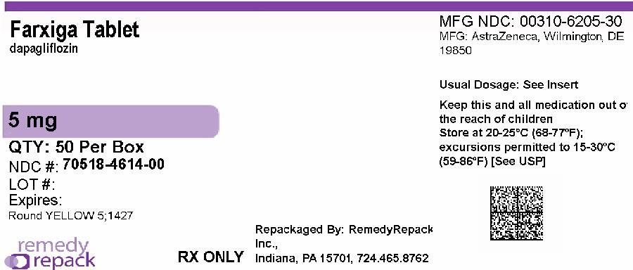
Mm1 (Farxiga 5mg 70518 4614 00)
FARXIGA (dapagliflozin) 5 mg film-coated tablets, packaged in a box of 50 by RemedyRepack Inc. The label includes storage instructions and states it is for prescription use only. The original manufacturer is AstraZeneca, Wilmington, DE.*
FDA Label Image

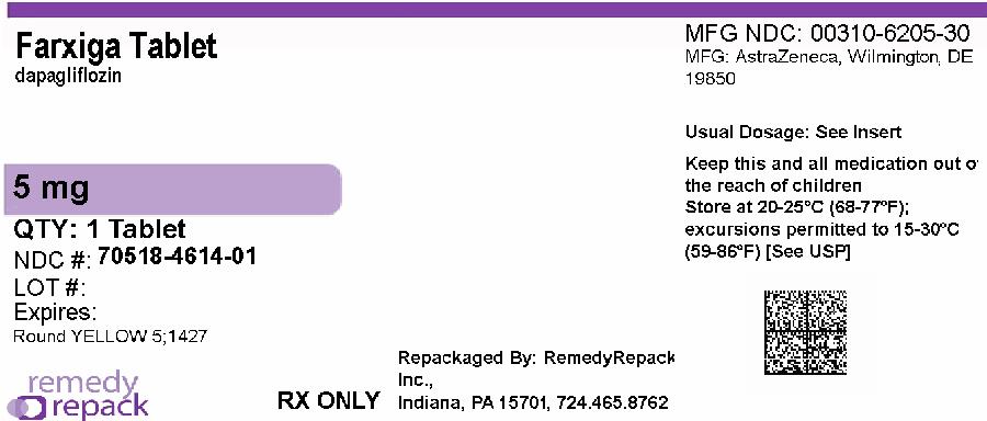
Remedy_label (Remedy Label)

Remedy_label (Remedy Label)
Label for Farxiga tablet 5 mg film-coated oral tablet. Includes quantity of 1 tablet per package. Labeler is RemedyRepack Inc. with repackaging information including location in Indiana and phone number. Manufacturer is AstraZeneca with MFG NDC 00310-6205-30. Storage instructions and usual dosage note are present along with a QR code.*
FDA Label Image

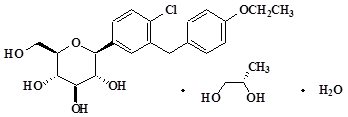
Dapagliflozin Chemical Structure (Dapagliflozin Struct)

Dapagliflozin Chemical Structure (Dapagliflozin Struct)
Chemical structure of Dapagliflozin, the active ingredient in FARXIGA tablets. The diagram includes the molecular components and arrangement characteristic of dapagliflozin as depicted in the product labeling.*
FDA Label Image

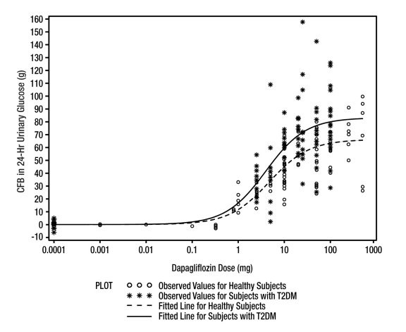
Figure 1 (Farxiga Fig1)

Figure 1 (Farxiga Fig1)
A scatter plot with fitted lines showing dapagliflozin dose (mg) on the x-axis and the change in 24-hour urinary glucose (g) on the y-axis. Data points differentiate observed values for healthy subjects and subjects with type 2 diabetes mellitus (T2DM). Two fitted dose-response curves are displayed for each subject group.*
FDA Label Image

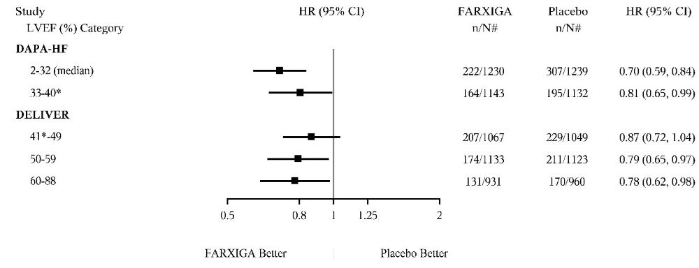
Figure_11 (Figure 11)

Figure_11 (Figure 11)
A forest plot chart comparing hazard ratios (HR) with 95% confidence intervals (CI) for FARXIGA versus placebo across different left ventricular ejection fraction (LVEF) percentage categories from the DAPA-HF and DELIVER studies. The chart visualizes the relative efficacy of FARXIGA in various LVEF subgroups, with numerical HR values and sample sizes for each group shown alongside.*
FDA Label Image

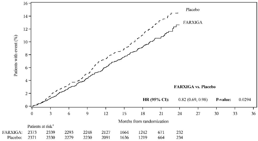
Figure-8a (Figure 8a)

Figure-8a (Figure 8a)
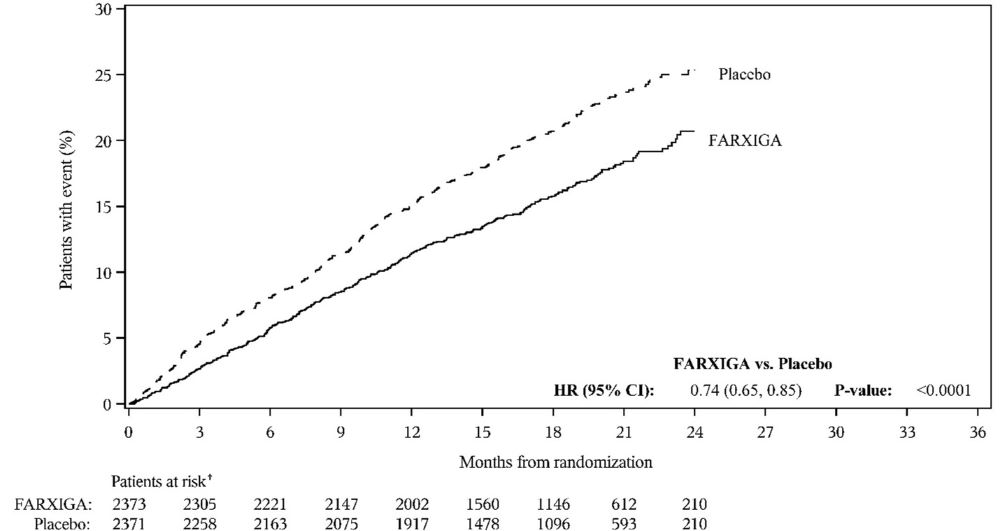
A survival curve chart comparing the percentage of patients with an event over months from randomization between FARXIGA and placebo groups. The y-axis shows patients with event (%) and the x-axis shows time in months up to 36. Data tables below the chart indicate the number of patients at risk in each group over time. The chart includes a hazard ratio (HR) with confidence interval and p-value for FARXIGA vs. placebo.*
FDA Label Image

Figure 10a (Figure 10a)

Figure 10a (Figure 10a)
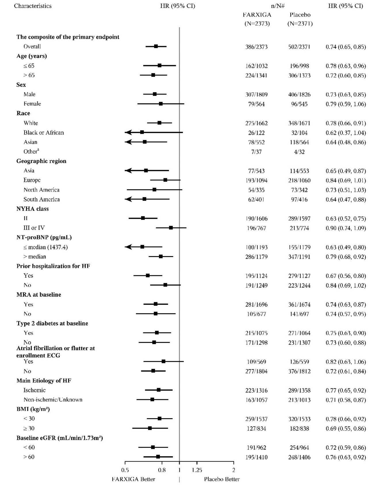
A forest plot showing subgroup analysis of the composite primary endpoint for FARXIGA (dapagliflozin) 5 mg film-coated tablets versus placebo. The chart displays hazard ratios with 95% confidence intervals across patient characteristics including age, sex, race, geographic region, NYHA class, NT-proBNP levels, prior hospitalization for heart failure, MRA use, type 2 diabetes status, atrial fibrillation, heart failure etiology, BMI, and baseline eGFR. The plot visually compares FARXIGA and placebo effectiveness, indicating where FARXIGA performs better or similarly to placebo.*
FDA Label Image

Figure-10b (Figure 10b)

Figure-10b (Figure 10b)
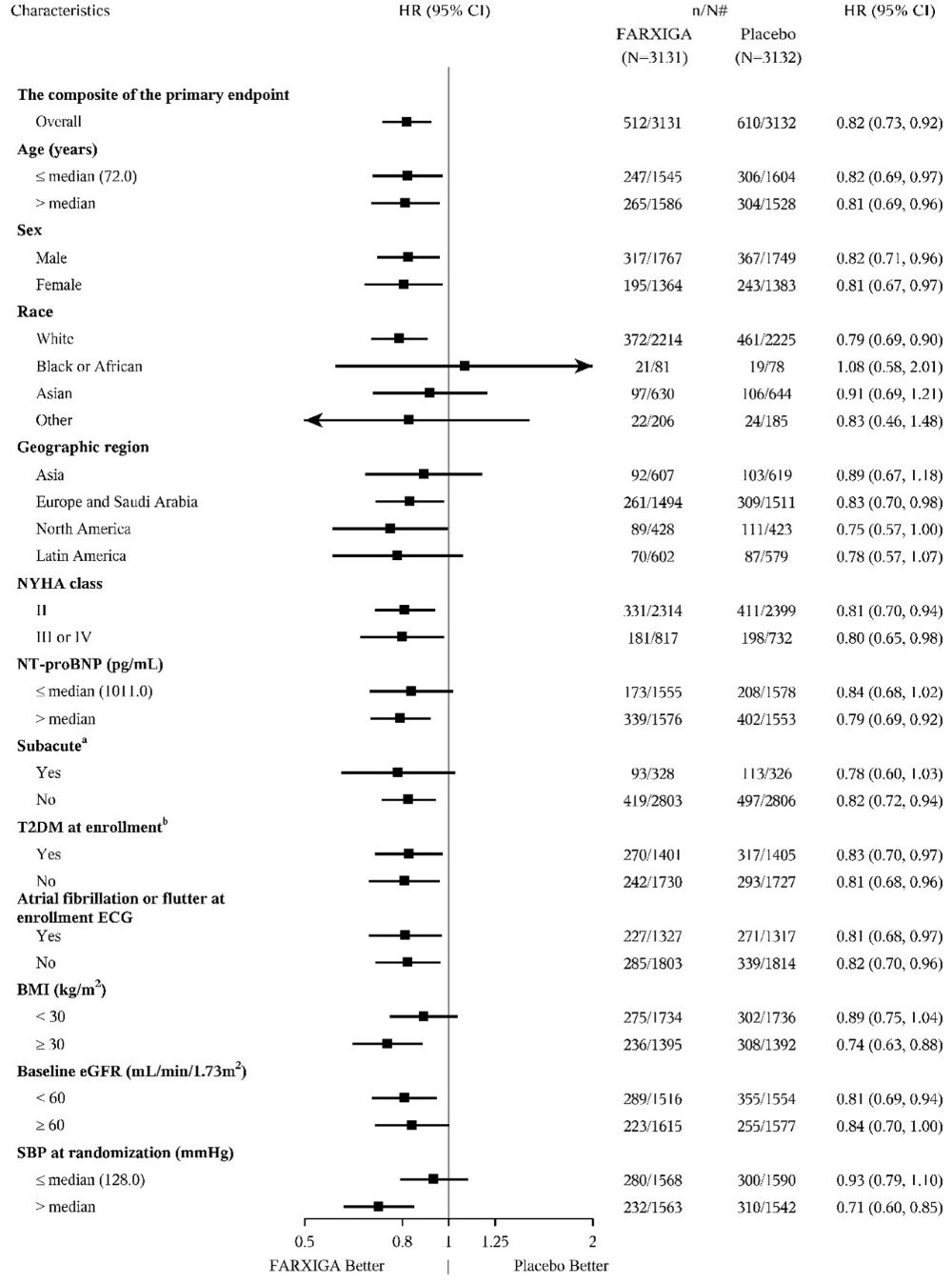
A forest plot chart comparing FARXIGA (dapagliflozin) versus placebo across various patient characteristics for the composite primary endpoint. It depicts hazard ratios (HR) with 95% confidence intervals (CI) and subgroup data by age, sex, race, geographic region, NYHA class, NT-proBNP levels, diabetes status, atrial fibrillation, BMI, baseline eGFR, and systolic blood pressure. The plot visually represents treatment effects favoring FARXIGA or placebo.*
FDA Label Image

Figure 4 (Figure 4)

Figure 4 (Figure 4)
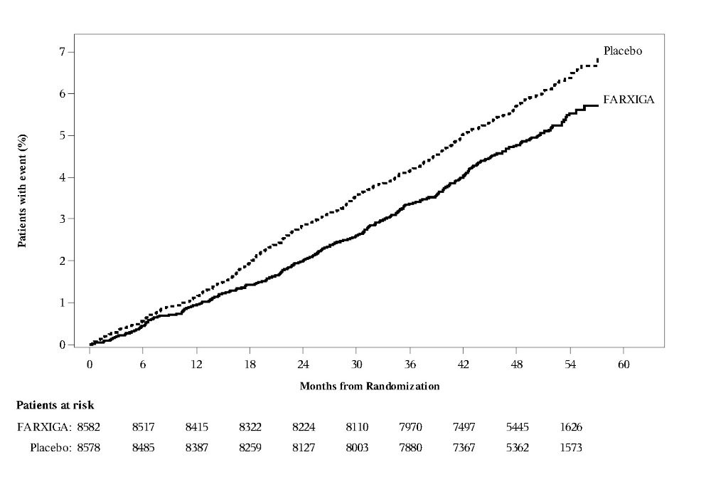
A line graph showing the percentage of patients with an event over time, measured in months from randomization, comparing FARXIGA (dapagliflozin) to placebo. The graph has two lines: a solid line for FARXIGA and a dotted line for placebo, with placebo showing a generally higher percentage of patients with events. Patient counts at risk for both groups are listed below the x-axis at various time points up to 60 months.*
FDA Label Image

Figure_6 (Figure 6)

Figure_6 (Figure 6)
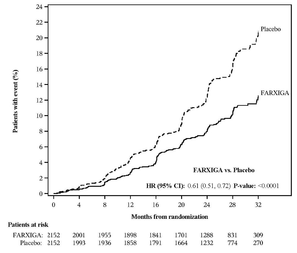
A Kaplan-Meier curve chart comparing the percentage of patients with an event over months from randomization for FARXIGA versus Placebo. The x-axis represents time in months, and the y-axis shows patients with an event as a percentage. Two lines represent FARXIGA (solid) and Placebo (dashed). Below the chart, a table lists patients at risk over time for both groups, and hazard ratio with confidence interval and p-value are indicated.*
FDA Label Image

Figure-7a (Figure 7a)

Figure-7a (Figure 7a)
A line graph comparing the percentage of patients with an event over time (months from randomization) between FARXIGA and placebo. The graph shows a lower event rate for FARXIGA compared to placebo over a period of about 30 months. Patient numbers at risk are listed below the graph for both FARXIGA and placebo groups, along with hazard ratio and p-value statistics comparing the two.*
FDA Label Image

Figure_7b (Figure 7b)

Figure_7b (Figure 7b)
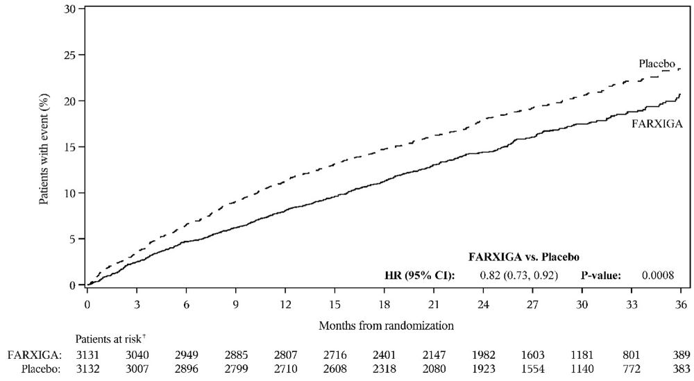
A line graph showing the percentage of patients with an event over 36 months from randomization comparing FARXIGA (dapagliflozin) and placebo. The graph includes patient counts at risk at various time points for both groups. FARXIGA shows a lower event rate over time compared to placebo, with hazard ratio (HR) 0.82 (95% CI 0.73, 0.92) and a P-value of 0.0008.*
FDA Label Image

Figure-8b (Figure 8b)

Figure-8b (Figure 8b)
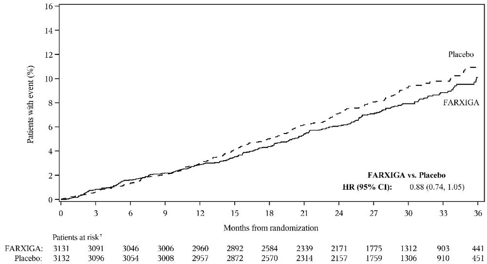
A line graph depicting the percentage of patients with events over 36 months from randomization for FARXIGA compared to placebo. The x-axis represents months, and the y-axis shows patients with events percentage. FARXIGA consistently shows a slightly lower event rate than placebo. Patient counts at risk decrease over time and are noted below the x-axis for both groups.*
FDA Label Image

Figure-9a (Figure 9a)

Figure-9a (Figure 9a)
A line graph comparing the percentage of patients with an event over 36 months from randomization between FARXIGA and placebo groups. The graph shows that the FARXIGA group has a lower percentage of patients with the event compared to the placebo group. The x-axis represents months from randomization, and the y-axis represents the percentage of patients with the event. Patient counts at risk are listed below the x-axis for both groups.*
FDA Label Image

Figure-9b (Figure 9b)

Figure-9b (Figure 9b)
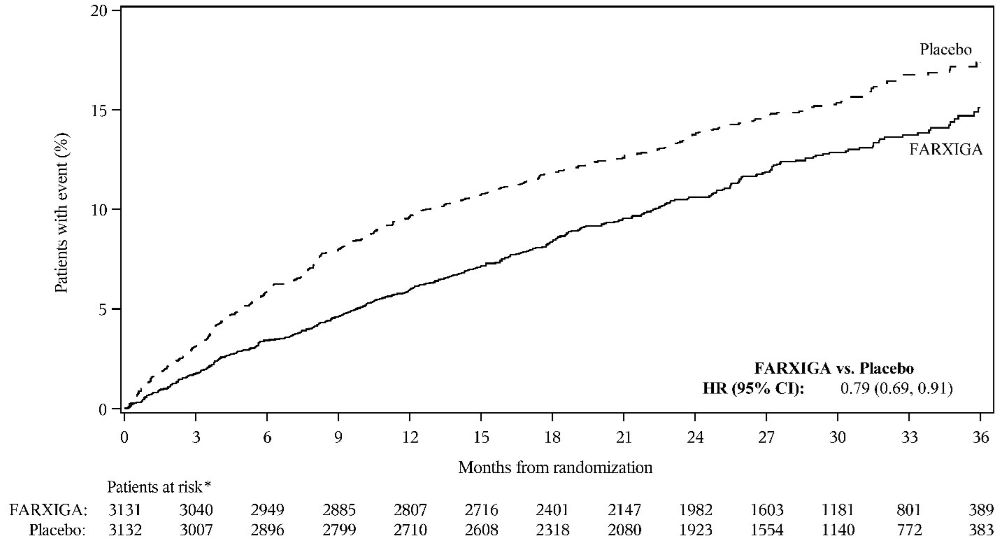
A line graph comparing the percentage of patients with events over months from randomization for FARXIGA versus placebo. The x-axis shows months (0 to 36), and the y-axis shows the percentage of patients with events (0-20%). Two lines represent FARXIGA and placebo, with FARXIGA consistently lower. Patient counts at risk for both groups are displayed below the x-axis. A hazard ratio (HR) of 0.79 with 95% confidence intervals is noted.*
FDA Label Image

Figure-2 (Firgure 2)

Figure-2 (Firgure 2)
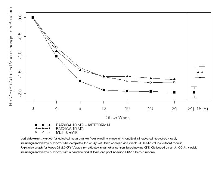
A line graph depicting adjusted mean change from baseline in HbA1c (%) over a 24-week study period comparing FARXIGA 10 mg alone, FARXIGA 10 mg combined with Metformin, and Metformin alone. The graph shows trends for each treatment group at multiple time points with error bars representing 95% confidence intervals at Week 24 (LOCF).*
FDA Label Image

Figure-3 (Firgure 3)

Figure-3 (Firgure 3)
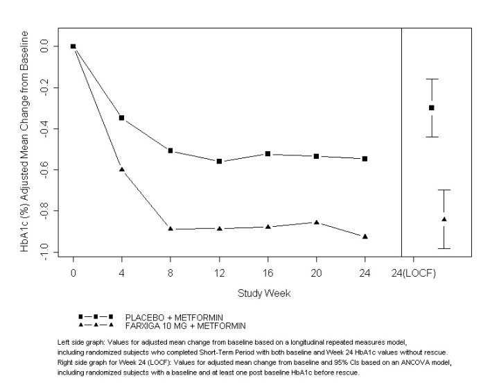
A line graph depicting adjusted mean change from baseline in HbA1c (%) over 24 study weeks comparing treatment with FARXIGA 10 mg plus Metformin versus placebo plus Metformin. The x-axis represents study weeks, and the y-axis shows HbA1c change from baseline. Two distinct lines indicate the treatment groups with error bars shown for Week 24 (LOCF) values and 95% confidence intervals.*
FDA Label Image

Figure 5 (Firgure 5)

Figure 5 (Firgure 5)
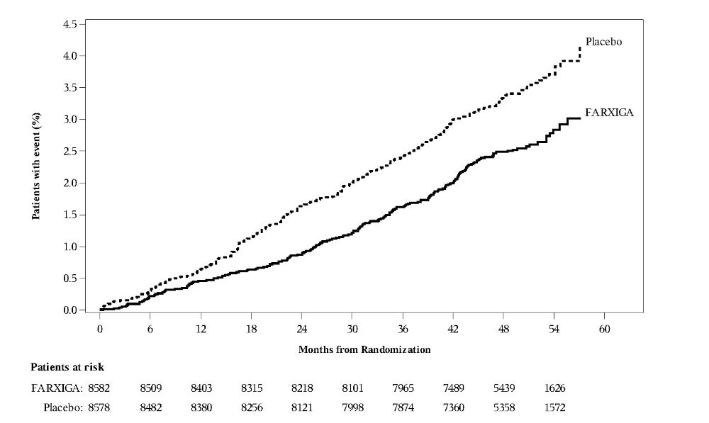
A line graph showing the cumulative percentage of patients with an event over months from randomization, comparing FARXIGA and placebo. The x-axis represents time in months up to 60, and the y-axis shows the percentage of patients with the event. Two lines are plotted: FARXIGA with a lower cumulative event rate than placebo over time. Below the graph is a table listing the number of patients at risk at various time points for both FARXIGA and placebo groups.*

* About these descriptions: Image descriptions on this page are generated by automated AI analysis of the product label images from the manufacturer's FDA label submission (SPL). They are provided for reference only and may contain errors or omissions. Always rely on the printed label itself and the official FDA labeling, and consult a pharmacist or healthcare professional with any questions about this product.