Pregabalin Capsule
Product Images NDC 72162-2304

View Photos of Packaging, Regulatory Labels, and Product Appearance

Product Visual Gallery

This gallery contains 15 technical images submitted to the FDA as part of the official labeling for Pregabalin (NDC 72162-2304). Unlike standard consumer photos, these assets often include clinical data figures, molecular chemical structures, and official manufacturer packaging layouts.

As provided by Bryant Ranch Prepack, these visuals offer a comprehensive scientific overview of the product's physical and chemical identity, aiding pharmacists and researchers in product verification and study.

FDA Label Image

Label (Lbl721622304)

Label (Lbl721622304)
Label for Pregabalin Capsules 150 mg by Bryant Ranch Prepack. The label indicates each capsule contains 150 mg Pregabalin and the package contains 1000 capsules. Storage instructions specify 20° to 25°C with permitted excursions between 15° to 30°C. Manufactured by Laurus Labs Limited. Rx only.*
FDA Label Image

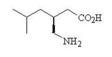
Pregabalinchemistrystructure (Pregabalin Chem Structure)

Pregabalinchemistrystructure (Pregabalin Chem Structure)
Chemical structure diagram of pregabalin, the active ingredient in the product PREGABALIN 150 mg oral capsules.*
FDA Label Image

Pregabalin-equation (Pregabalin Equation)

Pregabalin-equation (Pregabalin Equation)
A mathematical formula calculating creatinine clearance (CLCr) based on age, weight, serum creatinine level, and a factor adjustment for female patients represented by multiplication and division operations.*
FDA Label Image

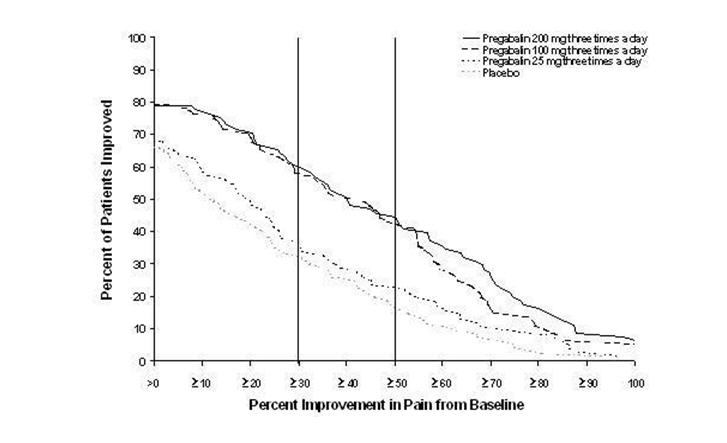
Pregabalinfig1 (Pregabalin Fig 01)

Pregabalinfig1 (Pregabalin Fig 01)
A line graph showing the percentage of patients improved versus the percent improvement in pain from baseline. It compares four groups: Pregabalin 200 mg three times a day, Pregabalin 100 mg three times a day, Pregabalin 25 mg three times a day, and placebo, with lines indicating varying levels of pain improvement among the groups.*
FDA Label Image

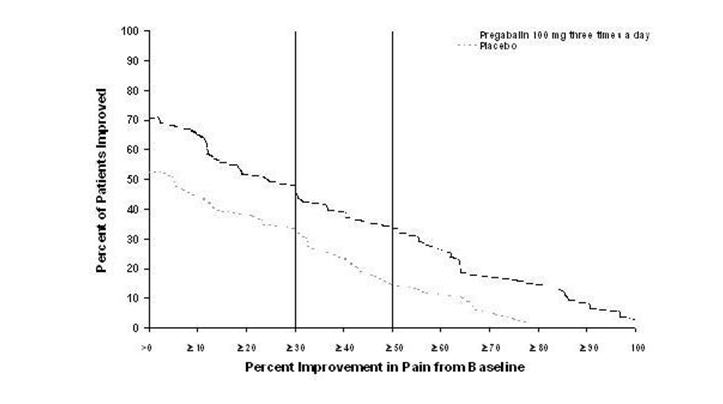
Pregabalinfig2 (Pregabalin Fig 02)

Pregabalinfig2 (Pregabalin Fig 02)
A line graph comparing the percent of patients improved versus percent improvement in pain from baseline for Pregabalin 100 mg three times a day and placebo. The y-axis shows percent of patients improved from 0 to 100, and the x-axis shows percent pain improvement from baseline ranging 0 to 100. Two lines depict results for Pregabalin and placebo, with Pregabalin demonstrating higher patient improvement percentages across pain improvement levels.*
FDA Label Image

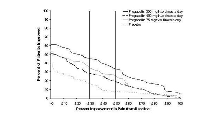
Pregabalinfig3 (Pregabalin Fig 03)

Pregabalinfig3 (Pregabalin Fig 03)
A line graph comparing the percent of patients improved versus percent improvement in pain from baseline for Pregabalin at doses of 75 mg, 150 mg, and 300 mg twice a day, along with placebo. The graph shows multiple lines representing each dose and placebo across a range of pain improvement percentages from 0 to 100.*
FDA Label Image

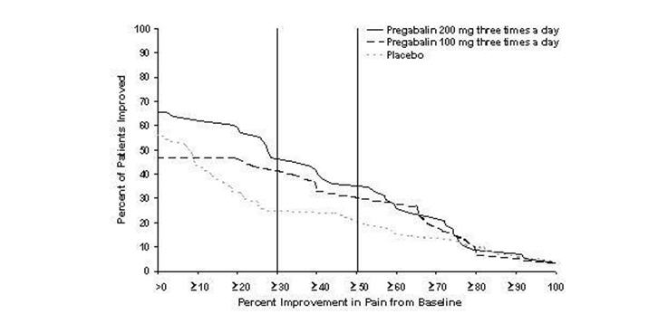
Pregabalinfig4 (Pregabalin Fig 04)

Pregabalinfig4 (Pregabalin Fig 04)
A line graph comparing the percent of patients improved versus percent improvement in pain from baseline for Pregabalin 200 mg three times a day, Pregabalin 100 mg three times a day, and placebo. The graph shows three lines indicating the rate of pain improvement among the groups over the range from 0 to 100 percent improvement.*
FDA Label Image

Pregabalinfig5 (Pregabalin Fig 05)

Pregabalinfig5 (Pregabalin Fig 05)
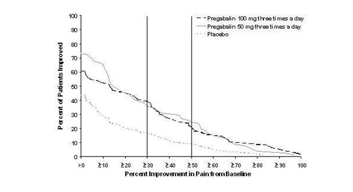
Kaplan-Meier plot showing percent improvement in pain from baseline on the x-axis and percent of patients improved on the y-axis. The graph compares outcomes for Pregabalin 100 mg three times a day, Pregabalin 50 mg three times a day, and placebo groups over a range of pain improvement percentages.*
FDA Label Image

Pregabalin-fig-06 (Pregabalin Fig 06)

Pregabalin-fig-06 (Pregabalin Fig 06)
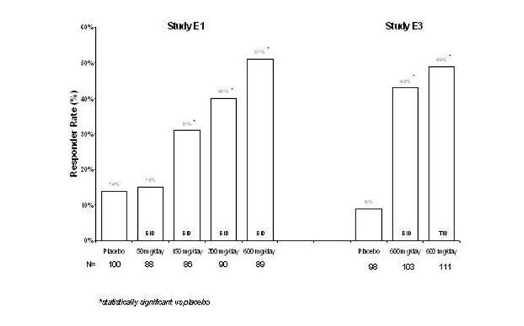
A bar chart comparing responder rates (%) across different doses of pregabalin versus placebo in two studies labeled E1 and E3. The x-axis lists placebo and various pregabalin doses in mg/day, while the y-axis shows responder rate percentages from 0 to 60%. The chart illustrates that higher doses of pregabalin have higher responder rates compared to placebo, with statistical significance indicated.*
FDA Label Image

Pregabalin-fig-07 (Pregabalin Fig 07)

Pregabalin-fig-07 (Pregabalin Fig 07)
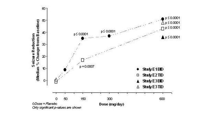
A line graph depicting seizure reduction as median percentage change from baseline on the y-axis against increasing dose in mg/day on the x-axis. The graph includes data points from four studies labeled E1 BD, E2 TID, E3 BD, and E3 TID, showing statistically significant seizure reduction at various doses compared to placebo, with p-values indicated for certain points.*
FDA Label Image

Pregabalin-fig-08 (Pregabalin Fig 08)

Pregabalin-fig-08 (Pregabalin Fig 08)
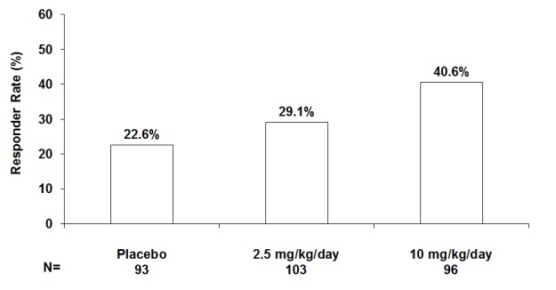
A bar chart illustrating responder rates (%) for three groups: Placebo with 22.6%, 2.5 mg/kg/day dosage with 29.1%, and 10 mg/kg/day dosage with 40.6%. Sample sizes are 93, 103, and 96 respectively.*
FDA Label Image

Pregabalin-fig-09 (Pregabalin Fig 09)

Pregabalin-fig-09 (Pregabalin Fig 09)
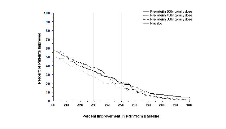
A line graph depicting percent improvement in pain from baseline on the horizontal axis and percent of patients improved on the vertical axis. The chart compares four groups: Pregabalin 300 mg, 450 mg, and 600 mg daily doses, plus placebo, showing the distribution of patient pain improvement percentages for each group.*
FDA Label Image

Pregabalin-fig-10 (Pregabalin Fig 10)

Pregabalin-fig-10 (Pregabalin Fig 10)
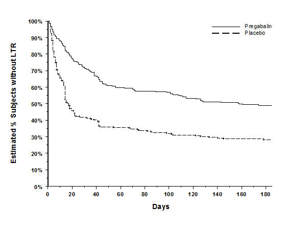
A Kaplan-Meier survival plot showing the estimated percentage of subjects without Lapse to Relapse Treatment (LTR) over 180 days, comparing Pregabalin treatment (solid line) and placebo (dashed line). The y-axis represents the estimated percentage without LTR, and the x-axis represents days.*
FDA Label Image

Pregabalin-fig-11 (Pregabalin Fig 11)

Pregabalin-fig-11 (Pregabalin Fig 11)
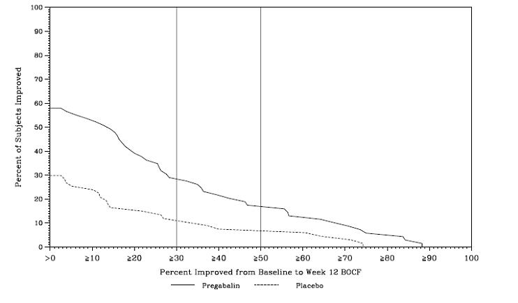
A line graph comparing the percentage of subjects improved from baseline to week 12 measured by BOCF between Pregabalin and placebo groups. The x-axis represents the percent improvement, ranging from 0 to 100, and the y-axis shows the percent of subjects improved from 0 to 100. Two lines plot the data: a solid line for Pregabalin, which consistently shows higher improvement percentages, and a dashed line for placebo, with lower improvement percentages throughout the range.*
FDA Label Image

Pregabalin-fig-12 (Pregabalin Fig 12)

Pregabalin-fig-12 (Pregabalin Fig 12)
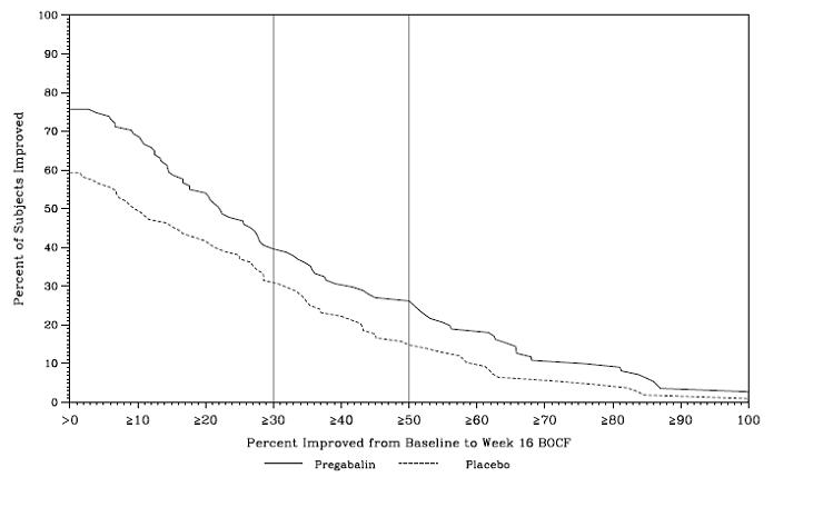
A line graph comparing the percentage of subjects improved over a range of percent improvement from baseline to Week 16 between Pregabalin and placebo groups. The x-axis represents percent improvement from 0 to 100, while the y-axis shows the percent of subjects improved from 0 to 100. One solid line indicates Pregabalin, and a dashed line indicates placebo, illustrating higher improvement percentages for Pregabalin at most points.*

* About these descriptions: Image descriptions on this page are generated by automated AI analysis of the product label images from the manufacturer's FDA label submission (SPL). They are provided for reference only and may contain errors or omissions. Always rely on the printed label itself and the official FDA labeling, and consult a pharmacist or healthcare professional with any questions about this product.