Keytruda Qlex Injection, Solution
Product Images NDC 0006-5083

View Photos of Packaging, Regulatory Labels, and Product Appearance

Product Visual Gallery

This gallery contains 44 technical images submitted to the FDA as part of the official labeling for Keytruda Qlex (NDC 0006-5083). Unlike standard consumer photos, these assets often include clinical data figures, molecular chemical structures, and official manufacturer packaging layouts.

As provided by Merck Sharp & Dohme Llc, these visuals offer a comprehensive scientific overview of the product's physical and chemical identity, aiding pharmacists and researchers in product verification and study.

Product Images & Figures Index

FDA Label Image

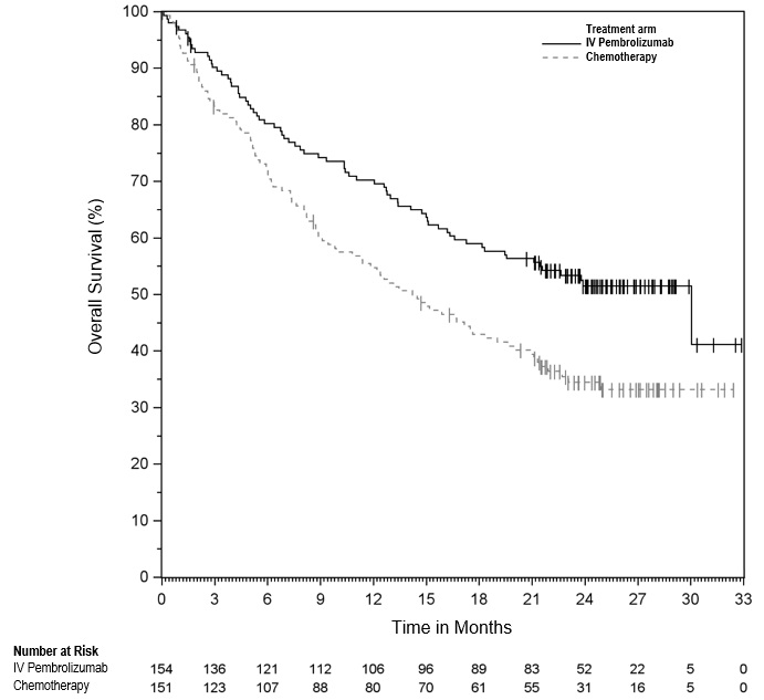
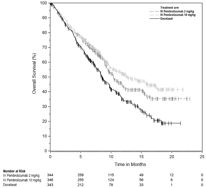
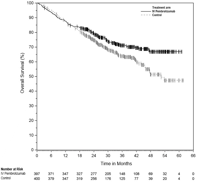
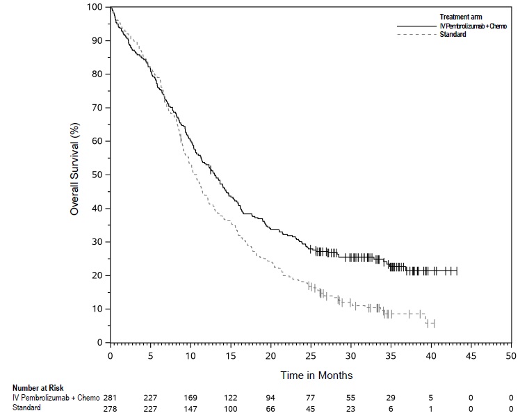
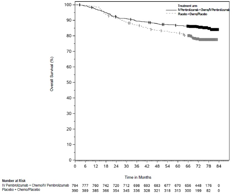
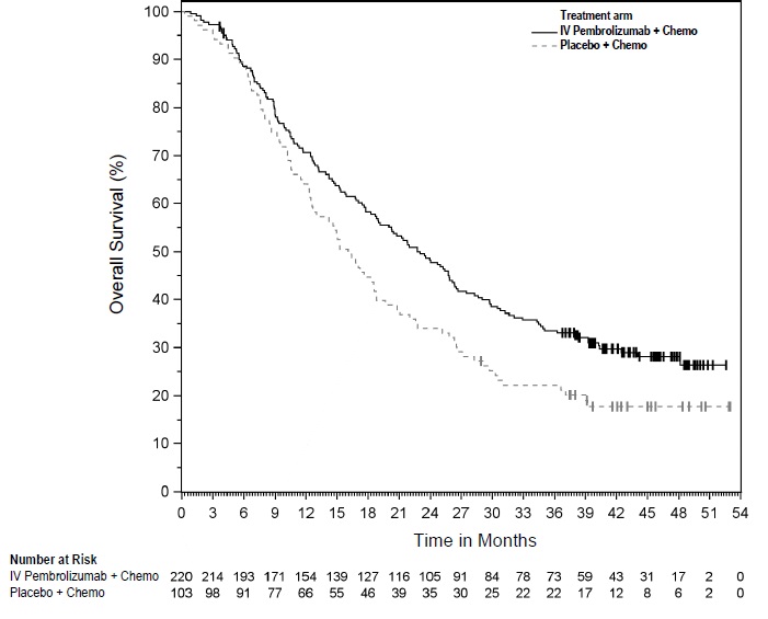
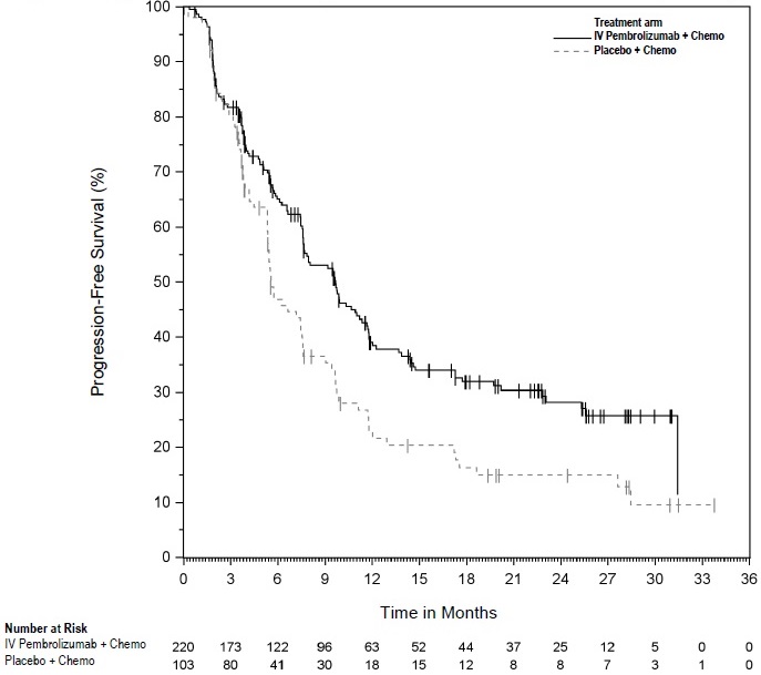
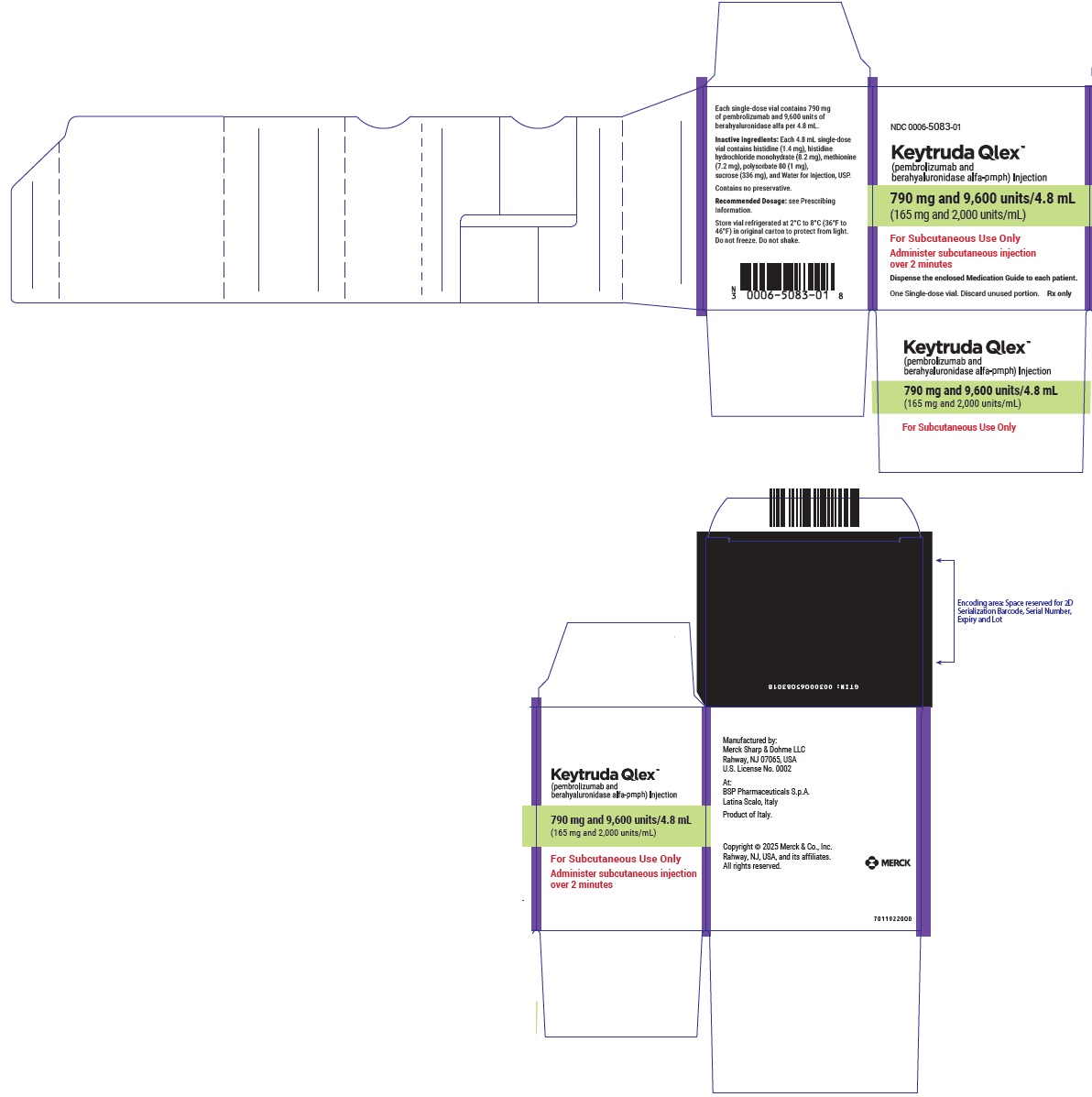
Figure 1 (Keytruda Qlex 01)

FDA Label Image

Figure 2 (Keytruda Qlex 02)

Figure 2 (Keytruda Qlex 02)
This description is not readable.*
FDA Label Image

Figure 3 (Keytruda Qlex 03)

Figure 3 (Keytruda Qlex 03)
This data provides a comparison of the recurrence-free survival rates over time for patients treated with IV Pembrolizumab versus Placebo. The graph illustrates a significant difference between the two groups, with the Pembrolizumab group showing better survival rates. This information is valuable for evaluating the efficacy of Pembrolizumab in the treatment of the condition being studied.*
FDA Label Image

Figure 4 (Keytruda Qlex 04)

FDA Label Image

Figure 5 (Keytruda Qlex 05)

FDA Label Image

Figure 6 (Keytruda Qlex 06)

Figure 6 (Keytruda Qlex 06)
This data likely represents a comparison of overall survival percentages between two groups - one receiving IV Pembrolizumad and the other on Control. The numbers at risk in each group are shown for different time intervals. The Time in Months varies from 3 to 33, and the number of patients at risk fluctuates accordingly.*
FDA Label Image

Figure 7 (Keytruda Qlex 07)

FDA Label Image

Figure 8 (Keytruda Qlex 08)

Figure 8 (Keytruda Qlex 08)
This is a comparison chart showing the number of individuals at risk over time for two different treatments: Trstmentam and Chemotherapy. The data is presented in a graph format showing months on the x-axis and number at risk on the y-axis. The chart shows the decrease in the number at risk over time for both treatments.*
FDA Label Image

Figure 9 (Keytruda Qlex 09)

FDA Label Image

Figure 10 (Keytruda Qlex 10)

FDA Label Image

Figure 11 (Keytruda Qlex 11)

FDA Label Image

Figure 12 (Keytruda Qlex 12)

Figure 12 (Keytruda Qlex 12)
This is a data illustration comparing the treatment effect of Pembrolizumab combined with Chemotherapy versus a control group over a span of 72 months. The graph displays the number of subjects from each group experiencing events at various time intervals. The line chart suggests a potential benefit of Pembrolizumab plus Chemotherapy compared to the control group based on the lower number of events in the treatment group over time.*
FDA Label Image

Figure 13 (Keytruda Qlex 14)

Figure 13 (Keytruda Qlex 14)
This text provides data related to the overall survival percentage based on the number at risk for two different treatment groups: IV Pembrolizumab + Chemo and Standard. The data includes the number of patients at risk at different time points (in months) as well as the corresponding survival percentages.*
FDA Label Image

Figure 14 (Keytruda Qlex 15)

Figure 14 (Keytruda Qlex 15)
This -generated text appears to be a graph showing "Overall Survival (%)" over time in months for two treatments - IV Pembrolizumab and a 'Standard' treatment. The number at risk for each treatment group is also mentioned. The graph indicates the survival rates for the two treatments at different time points.*
FDA Label Image

Figure 15 (Keytruda Qlex 16)

Figure 15 (Keytruda Qlex 16)
This is a graph showing the comparison between the treatment of IV Pembrolizumab + EV and Chemotherapy over a period of time in months. The number at risk for each treatment decreases over time as shown in the data presented. The graph provides insight into the effectiveness and progression of the treatments being evaluated.*
FDA Label Image

Figure 16 (Keytruda Qlex 17)

FDA Label Image

Figure 17 (Keytruda Qlex 18)

Figure 17 (Keytruda Qlex 18)
This appears to be a chart depicting Overall Survival (%) over time for two different treatments: Pembrolizumab and Chemotherapy. The X-axis shows time in months, ranging from 0 to 26 months. The Y-axis displays the percentage of overall survival. The chart includes the number at risk for each treatment at different time points.*
FDA Label Image

Figure 18 (Keytruda Qlex 19)

Figure 18 (Keytruda Qlex 19)
This document provides information on the treatment comparison between Pembrolizumab and Chemotherapy in terms of Progression-Free Survival over time in months. The chart displays the number at risk for each treatment group at different time points. The data suggests that Pembrolizumab had a higher number of patients at risk in comparison to Chemotherapy across the observed months.*
FDA Label Image

Figure 19 (Keytruda Qlex 20)

FDA Label Image

Figure 20 (Keytruda Qlex 21)

FDA Label Image

Figure 21 (Keytruda Qlex 22)

Figure 21 (Keytruda Qlex 22)
This is a table showing the "Number at Risk" and "Overall Survival" for two different treatment groups over a period of time in months. The treatments compared are Pembrolizumab + Chemo and Chemo only. The data includes the number at risk, overall survival rates in percentages, and the time in months.*
FDA Label Image

Figure 22 (Keytruda Qlex 23)

FDA Label Image

Figure 23 (Keytruda Qlex 24)

FDA Label Image

Figure 24 (Keytruda Qlex 25)

FDA Label Image

Figure 25 (Keytruda Qlex 26)

FDA Label Image

Figure 26 (Keytruda Qlex 27)

FDA Label Image

Figure 27 (Keytruda Qlex 28)

FDA Label Image

Figure 28 (Keytruda Qlex 29)

FDA Label Image

Figure 29 (Keytruda Qlex 30)

Figure 29 (Keytruda Qlex 30)
This text appears to be showing data related to a clinical trial comparing the treatment effectiveness of IV Pembrolizumab combined with chemotherapy versus a placebo combined with chemotherapy in terms of overall survival percentages over a period of 40 months. The numbers provided indicate the number of subjects at risk for each treatment group at various time points in months during the trial.*
FDA Label Image

Figure 30 (Keytruda Qlex 31)

FDA Label Image

Figure 31 (Keytruda Qlex 32)

Figure 31 (Keytruda Qlex 32)
Progression-Free Survival (%) This text appears to show a comparison between two treatments - Pembrolizumab + Lenvatinib and Sunitnib, in terms of progression-free survival over a period of time in months. The graph displays the percentage over time with data points at different intervals. The number at risk or the number of patients still being evaluated for progression is also provided for both treatment groups.*
FDA Label Image

Figure 32 (Keytruda Qlex 33)

FDA Label Image

Figure 33 (Keytruda Qlex 34)

Figure 33 (Keytruda Qlex 34)
This text describes a comparison between two treatments, IV Pembrolizumab and placebo, in terms of Disease-Free Survival over time in months. The data includes the number at risk for each treatment group at different time points. This information can help evaluate the effectiveness of Pembrolizumab compared to a placebo in terms of disease-free survival.*
FDA Label Image

Figure 34 (Keytruda Qlex 35)

Figure 34 (Keytruda Qlex 35)
This text appears to be a chart showing the overall survival percentage over time in months for a medical treatment involving IV Pembrolizumab and Placebo. The chart displays the number of participants at risk at various time points during the study. The data indicates the trend of survival rates for the two treatment groups over a span of 75 months.*
FDA Label Image

Figure 35 (Keytruda Qlex 36)

Figure 35 (Keytruda Qlex 36)
This is a chart depicting the Progression-Free Survival (%) of two different treatment options over a period of 42 months. The treatments involved are IV Pembrolizumab + Chemotherapy (pacitaxel and carboplatin) and Chemotherapy alone. The chart shows the percentage of patients without disease progression at different time points.*
FDA Label Image

Figure 36 (Keytruda Qlex 37)

Figure 36 (Keytruda Qlex 37)
This text contains data on Progression-Free Survival (%) for two treatments: IV Pembrolzumab + Chemo and Chemo (paclitaxel and carboplatin). The data shows the number at risk for each treatment group at different time points (0, 6, 18, 30, and 36 months).*
FDA Label Image

Figure 37 (Keytruda Qlex 38)

Figure 37 (Keytruda Qlex 38)
The text mentions a treatment involving IV Pembrolizumab and Lenatinib, along with a chemotherapy regimen. The numbers indicate time in months and the number at risk for each treatment group. This data may be part of a study or clinical trial evaluating the effectiveness of these treatments over time.*
FDA Label Image

Figure 38 (Keytruda Qlex 39)

Figure 38 (Keytruda Qlex 39)
This is a table showing the "Number at Risk" in terms of progression-free survival percentage over different time points in months for two treatments - IV Pembrolizumab + Lenvatinib and Chemotherapy. The data is presented at various time intervals up to 27 months.*
FDA Label Image

Figure 39 (Keytruda Qlex 40)

Figure 39 (Keytruda Qlex 40)
This is a chart showing Event-Free Survival percentages over time, comparing treatment with Pembrolizumab with chemotherapy versus Pembrolizumab alone and comparing Placebo with chemotherapy. The data shows the number at risk at different time points in months. The chart represents clinical trial results, with the x-axis showing time in months and the y-axis showing Event-Free Survival percentages.*
FDA Label Image

Figure 40 (Keytruda Qlex 41)

Figure 40 (Keytruda Qlex 41)
This description provides information about the number at risk and the overall survival percentages at different time points for two treatment groups: IV Pembrolizumab + Chemotherapy and Placebo + Chemotherapy. The data is presented over a time period of 84 months with survival percentages displayed at intervals.*
FDA Label Image

Figure 41 (Keytruda Qlex 42)

Figure 41 (Keytruda Qlex 42)
This data provides information on overall survival rates (%) over time in months for two groups: one receiving IV Pembrolizumab + Chemo and another receiving Placebo + Chemo. The number at risk for each group is also indicated at various time points.*
FDA Label Image

Figure 42 (Keytruda Qlex 43)

Figure 42 (Keytruda Qlex 43)
This is a table showing the Progression-Free Survival (%) at different time points (in months) for the treatment groups receiving IV Pembrolzumab + Chemo and Placebo + Chemo. The table also includes the number at risk for each group at specific time intervals.*
FDA Label Image

Principal Display Panel (395 mg and 4,800 units/2.4 mL Vial Carton)

FDA Label Image

Principal Display Panel (790 mg and 9,600 units/4.8 mL Vial Carton)

* These product label images have been analyzed using experimental machine learning. Please verify findings with the primary label text.