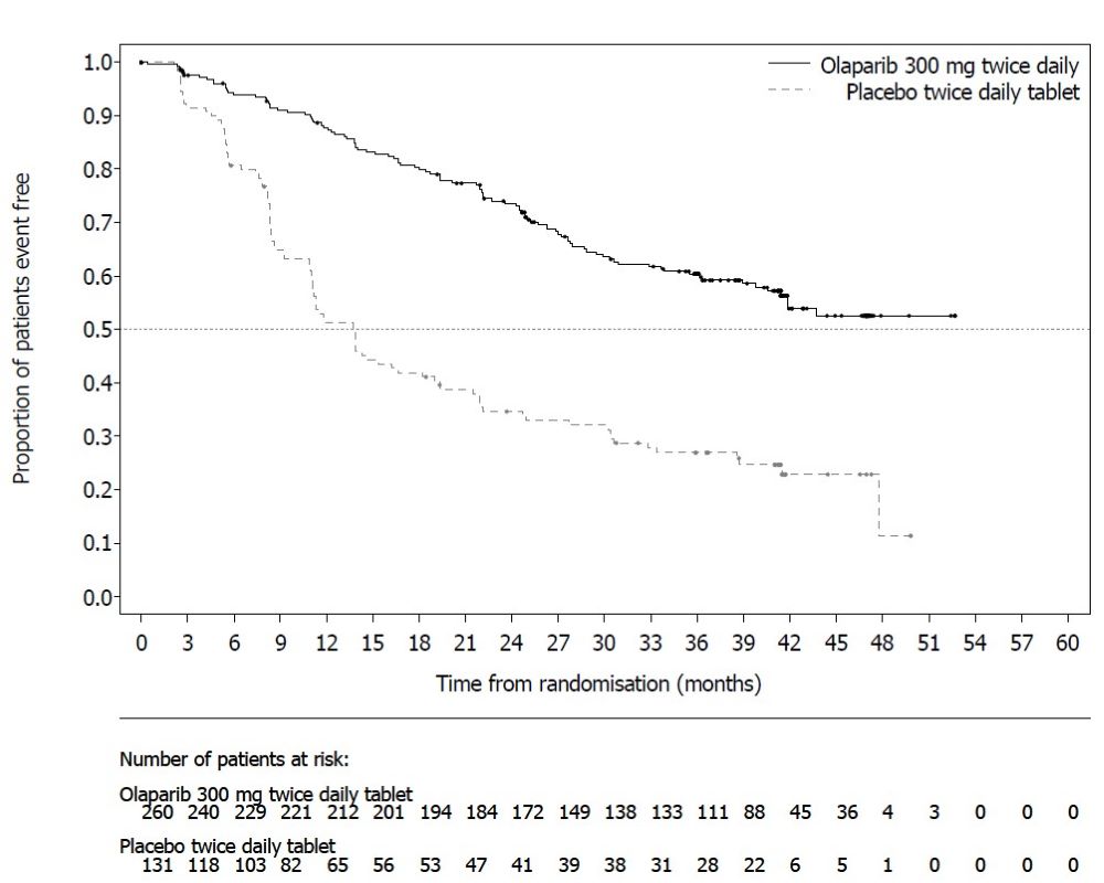
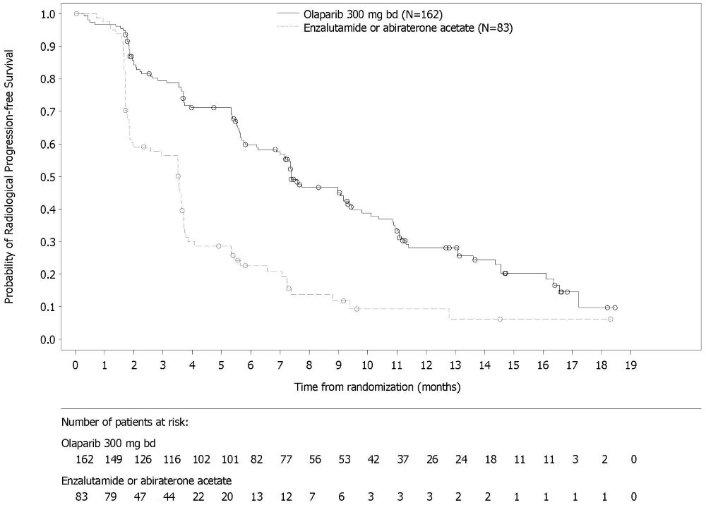
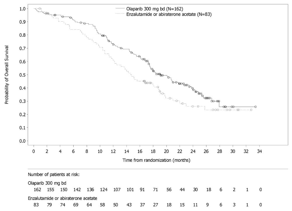
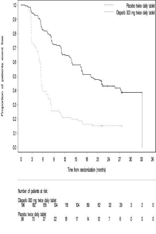
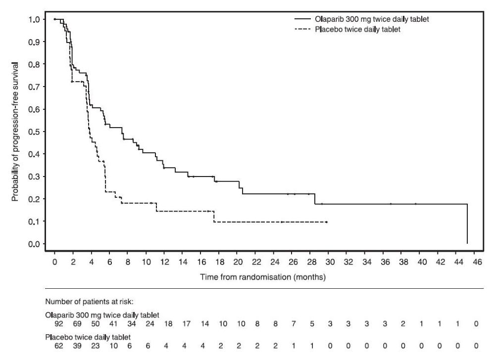
Figure 6

The text describes a graph showing the number of patients at risk over time, since randomization in a medical study. The study involved two groups of patients, one receiving a medication called 'Olaparib' and the second group receiving a placebo. The graph shows the number of patients at risk for both groups over a period of 18 months since the start of the study. The data is displayed in percentages on the X-axis, with tick marks at intervals of 25% and 50%. The Y-axis displays the number of patients at risk.*