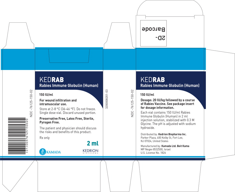
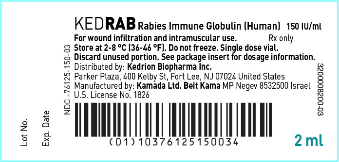
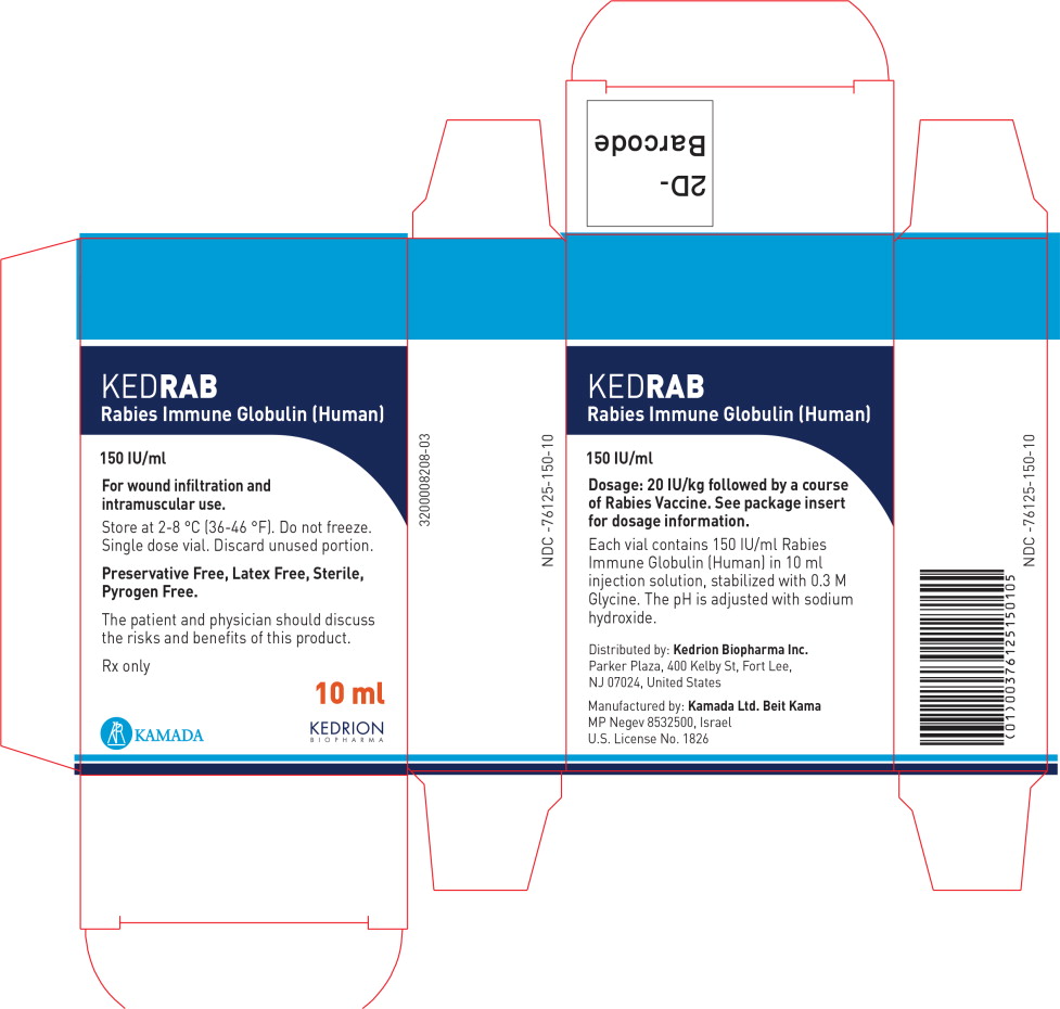
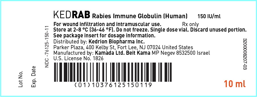
Ked00 0003 01
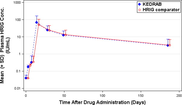
This appears to be a graph plotting the mean plasma concentration of HRIG (Human Rabies Immune Globulin) over time after drug administration. The Y-axis shows the concentration in IU/mL and the X-axis shows the time in days. The graph shows that the HRIG concentration initially peaks within the first day of administration and then gradually declines over time. Not much else can be interpreted as the rest of the data is missing.*